★★★★★

Wes Anderson’s new film The French Dispatch’s trailer came out a while back and it was spectacular. It brought me back to 2013 when I watched his film for the first time. The Grand Budapest Hotel. At that time the poster looked cute and I decided to casually give it a watch without much thought, a common tendency of mine.
At the end of the 2+ hours, I found myself quickly searching for the film’s art director on my smartphone. I was floored–I have never seen such visually detailed movie before, every frame was like a painting.
最近ウェス・アンダーソン監督の最新映画「ザ・フレンチ・ディスパッチ」の予告が披露され、抜群としか言うようがない。
2014年に初めてウェス・アンダーソン監督の作品に出会った頃を思い出した。その時上映されていた「ザ・グランド・ブダペスト・ホテル」のポスターをたまたま見かけて、いい感じだと思ったので、気軽くに見に行ったんのだ。
あっという間に2時間が過ぎたが、居ても立っても居られない気持ちで私は携帯で映画のアートディレクターについて検索していた。人生で初めてこんなにビジュアル的に完成度が高い映画を観て、衝撃的だった。
(ABOVE) The Trailer of the movie
(上)映画の予告

I think it started at around 10 minutes into a film where there was a scene with a shoe shine boy being so compositionally perfect despite being only shown for a second. I was hooked from that point on. In this article, I would like to talk about 3 points on why this film is a masterpiece, even though there are many others.
実は映画が始まった10分後に「靴磨きをしている子供」のシーンから 惹かれていた。1秒しか見えないシーンなのに、構図の完璧さが一瞬で感じられる。これから、この映画の面白いポイントを三つ、より詳しくご紹介したいと思う。
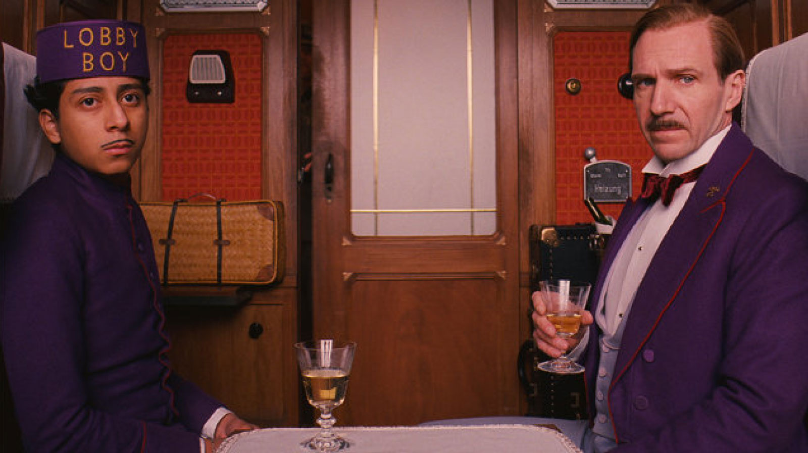
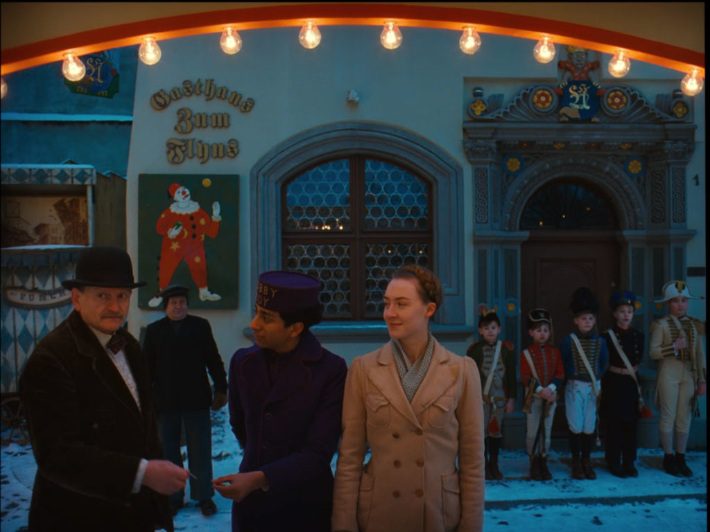
(TOP) The main characters of the film, Zero (left) and Gustave (right).
(上) 映画の主人公、ゼロ(左)とグスタフ(右)
★ Outline / 概要 ★
1930年代のヨーロッパが背景の華やかなホテルを中心としたストーリーである。主人公の二人は、ホテルのコンシェルジュの「グスタフ・H」と新人ロビー・ボーイの「ゼロ」である。グスタフが無実の罪で捕まり、ゼロの助けで逃げることから生じる様々な面白い展開の物語だ。
★ #1 The Universe in every Prop • 小道具への工夫 ★

(Clockwise from the left) Passport, stamps and currency notes from the fictional country of Zubrowska
(左から) 虚構の国「ズブロフカ」のパスポート、切手、紙幣
The film is brimming with many beautiful, intricate props that most people would not bat at eye at. However, a point that the audience should know to appreciate the film more is that every little prop is handmade to fit into this fictional world–Every advertisement, every piece of note in the background, every item.
ウェスの映画の世界を作るにはとてつもない工夫が必要だ。特に、すべての小道具に、その特別な世界観が潜んでいる-背景にある目立たない広告から小さいノートに至るまで。虚構の国「ズブロフカ」のため、王様の肖像画、紙幣、切手などもしっかりデザインされている。

(ABOVE) Several newspaper designs shown very briefly in the film
(上) 新聞のデザイン

(ABOVE) How a Mendl’s packaging opens up
(上)「Mendl’s」というお菓子店のパッケージの開け方
Another prominent prop is the packaging for Mendl’s, a lovely sweet shop in the world of Zubrowka. Of course, it has nice lettering and a lovely shade of pink but the key is in the way it opens up. When you pull the ribbon, the box flips out dramatically on all 4 sides seamlessly to reveal the beloved dessert adorably standing in the middle. The fact that they considered even the movement of the prop reflects how seriously they take their prop-making.Re-creating the fictional universe to such intricacy is often said to be for the actors. It helps them immense in this illusion, it is kind of like how actors/actresses image background stories for the roles beyond the script to mould the character more realistically. A good example is the currency and the stamp used in the Grand Budapest, you have even the portrait of the imagined King of the fictional world and the country’s very own crest.
そして、菓子店の「Mendl’s」のパッケージも素敵なデザインだ。もちろん、細かいレタリングと柔らかいピンク色がいいが、ハイライトしたいのは開け方である。リボンを引っ張ると、箱の四面が同時に開き、真ん中のお菓子が登場する。動きまで配慮するのは称賛すべきところだと思う。そこまで小道具をやるのは、鑑賞者だけでなく、役者のためでもある。現実から離脱し、その映画の世界に完全に没頭する道具として使われている。

(ABOVE) Further beautiful examples of the Mendl’s brand identity seen in various scenes
(上)「Mendl’s」のブランドアイデンティティーが見える様々なシーン
★ #2 Take your references seriously • 参考の緻密な再現 ★

(1)A comparison with a 1908 image of a Hotel in Cairo with similar inconsistencies in letter spacing.
タイトルの字間の少し不規則ところを1900年代カイロにあったホテルとの比較
(2)A group picture of the Grand Budapest Hotel staff with some employees taking a half-knee and some sitting with their legs slanted.
片膝についたり、斜めに座ったりしたなど職業によって姿勢をするグループ写真
(3)A beautiful painted background
水彩で塗られた背景
Everything seems natural or obvious in Wes’s fictional world but everything is researched, debated and designed.
For example in the masthead of the movie poster, you can see that the kerning (or spacing between alphabets) is off in some areas. You would think that it is a mistake but it is actually the genius of Wes. The team underwent intense research into the European hotels of that bygone era. An old steel hotel sign from the 1930s Cairo was especially picked out as it had many spacing errors blacksmiths often commit in the process of making the letterings with the tools then. They replicated these errors intentionally even if it might seem like a mistake on their part–there is soul in these things.
There are many other occurrences that seem natural initially but unique on a second look–Such as the very intentional half-knee pose when taking the photograph. I also love the painted backgrounds, very much like the hand-painted sets in old films and theatre. Usually they would seem cheesy in this day and age but they merge beautifully with the rest of film’s universe.
映画に表されている要素や世界観は自然に見えるが、隅から隅までのディテールが研究され、討論され、デザインされていた。
例えば、映画ポスターのタイトルの字間は少し不規則で広すぎると思われるかもしれないが、それはウェスがリサーチした結果だ。1930年代カイロにあったホテルの金属性の看板を参考にし、タイトルを作ったので、当時の道具で作るとよく現れるエラーを再現した。
他の当たり前のように見えそうな変わっているところが映画の端々にある。写真を撮る時、片膝をついたり、斜めに座ったりなど職業によって姿勢を取るのもユニークだ。また、映画の中の水彩で塗られた背景が好きだ。古いアメリカ映画のセットのフェイクな背景を思い出させるから、懐かしい雰囲気だった。ちょっとダサくて、違和感があるので、最近滅多に使われていないが、この映画の世界観にピッタリである。
★ #3 The framing and blocking of things, characters and places • 物、人、場所の位置と大きさ ★

(ABOVE) The changes in aspect ratio according to the time period shown
(上) 画面の縦横比は時代によって変わる
The physical design of the places and things are only the tip of the iceberg. Wes has also put in considerable effort in the arrangement and framing of these things.
The aspect ratio of each scene changes according to the time period that it reflects. In the beginning–supposedly the modern age–the standard 16:9 ratio we know of today is used. However, when the author recalls back to the 1968, the aspect ratio changes to the widescreen ratio 2.4:1 of the 50s and 60s. Furthermore, when the main character further recalls back to 1932, the 4:3 squarish ratio used by black and white films of that time is applied.
On a closer look, the positioning of the character is also linked to its development in the story. A disciple and lobby boy at the start, Zero mostly appears in the background while his teacher, Gustave is usually at the front, big and close to the camera. However this changes at the pivotal scene where Zero saves Gustave to which he said “we’re brothers” From that point on, they are equals and they began to be shown on equal levels and equal sizes. This is very similar to how they divide the stage in 9 sections in theatre for different uses.
物質的な物や場所はこの映画のわずかな一部だけだ。物と人物の位置、移動、また画面の枠なども相当な工夫がされていた。
シーンの時代によって、画面の縦横比が変わる。例えば、最初のシーンは現代なので、現代の映画に使われている16:9だが、1968年を回想する時に50ー60年代によく使われたワイド画面2.4:1に変わる。さらに、1932年の回想シーンでは4:3の画面が使われた。普段人が見落とす部分でも工夫するのは素晴らしいと思う。
よく見ると、人物はストーリー中の立場で画面上の位置が計画されている。最初弟子となったゼロは主に背後に小さく見せられ、グスタフはいつも前にいて、大きく映されている。しかし、ゼロがグスタフを救った肝心なシーンでは同じサイズ、「これから我々は兄弟だ」というセリフもあって、その瞬間から平等になったという意味もある。こういう前景と背景をきちんと分ける手法は演劇によく利用されている。

★ Ending Words ★ まとめ ★
Today, I only cited one of the many masterpieces of Wes Anderson because there is just too much to talk about. Every of his film has a soul, a time, a place and a feeling of its own. “Rushmore”–has a romance towards prestigious private schools and the plethora of extracurricular activities(even eccentric ones) “Life Aquatic of Steve Zissou”–has the fascination towards the deep sea and nautical culture. “Moonrise Kingdom”–has references to cartography and an adoration for the world of boy scouts. If you haven’t watched them, please do yourself a favour and immense yourself in the spectacular world of Wes Anderson.
今日、ウェス監督の映画の中の一つしか言及していないが、言えることはさらに無数にあるのです。彼の映画ごとに、独特な魂が潜んでいる-自分ならではの場所、時間、雰囲気など。 “Rushmore”– 風変わりな様々な部活動と豪華な私立学校へのロマン。“Life Aquatic of Steve Zissou”-航海のカルチャーと深海への冒険。“Moonrise Kingdom”–地図作成オタクとボーイスカウトのキャンプの世界。これらの映画は絶対に観る価値があります。
DISCLAIMER☞The writing and content have seem odd during the attempt to draw a parallel between my limited Japanese ability and English expressions. This is for my practice, let me know areas of improvements thanks. Special thanks to my Japanese teacher, Naoko.