
Bobo Claypot Porridge. (2015)
Mentor: Patrick Gan. Designer: Shannon Teoh
Client
Food & Beverages / Commercial / Brand Identity
Mediums
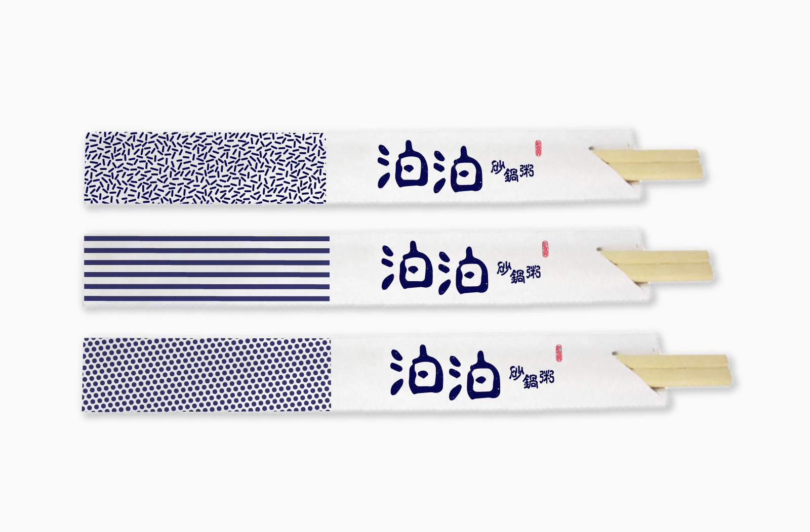
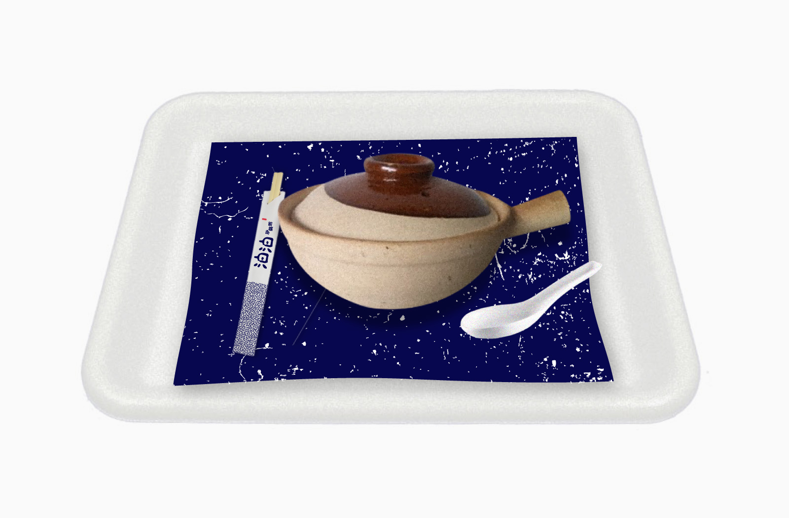
Typography, Graphics, Packaging, Namecard, Stationery, Naming
Synopsis / Introduction
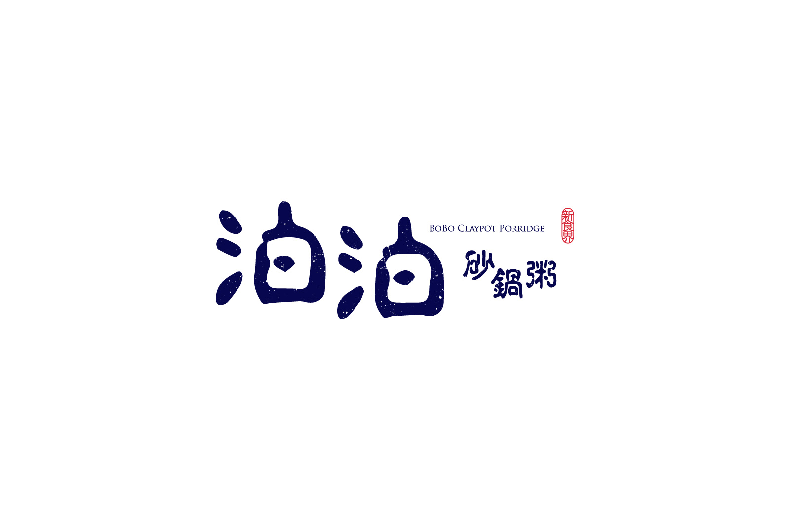
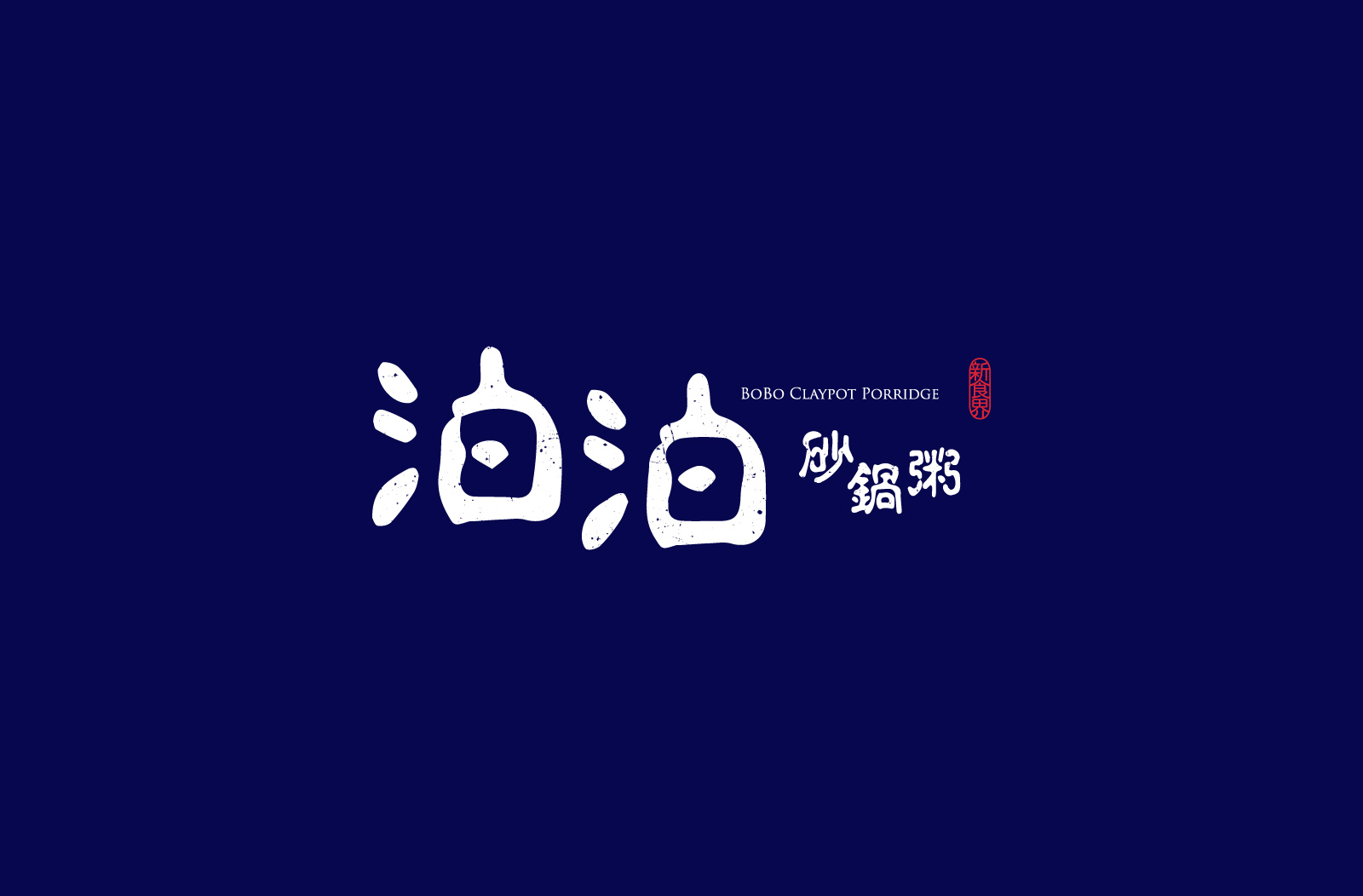
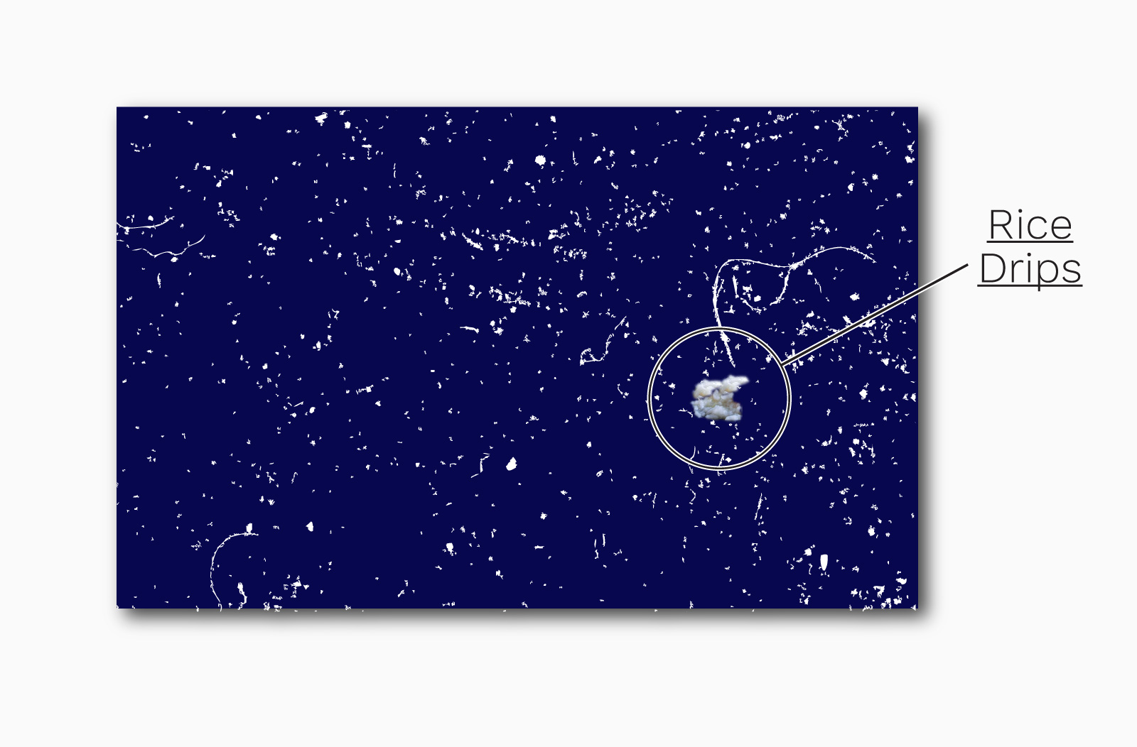
“泊(bo)” is a character meaning ‘float’ made of “氵(water)” and “白(white)”, it is a suitable for our brand since porridge is essentially white rice floating on water. Targeted at South-east Asia, it needs to both retain the oriental soul and be catchy to malay-speakers. “Burbur” means porridge in malay and it led to the similar-sounding “Bobo Claypot Porridge” that is suitable for both cultures. Dynamic arrangements of calligraphic, watery typography in the rice white logo floats on the contrasting dark blue. Rice grain motifs and claypot textures accentuates the new traditional style of the brand.
泊泊砂锅粥的名字来源于马来文的单词“burbur”,该词直接的意思是粥。就如粥是在水上垺的白米,“泊泊”是一个不只对华人,但也对马来人很简单容易上口的名字。为了东南亚打造的品牌,它用的是“新传统风格”来迈向吸引不同文化的食客。品牌应用着如砂锅表面的质地和米饭似的花纹来制造一个独一的品牌体验。

rice grains pattern, stripes, dots & claypot textures.


![]()
![]()