
Yoko Yoko Fried Dumplings. (2015)
Mentor: Patrick Gan Designer: Shannon Teoh
Client
Food & Beverages / Commercial / Brand Identity
Mediums
Typography, Graphics, Stationery, Packaging, Uniform, Naming
Synopsis / Introduction
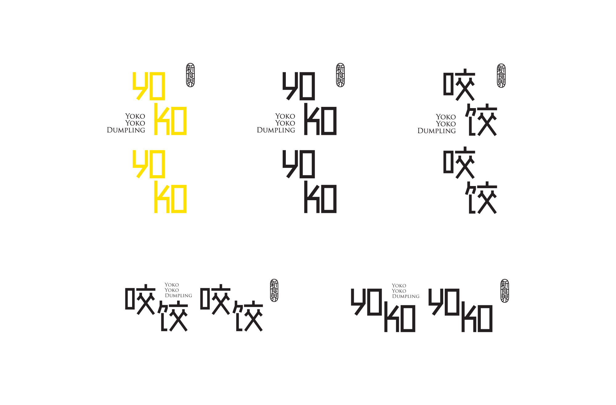
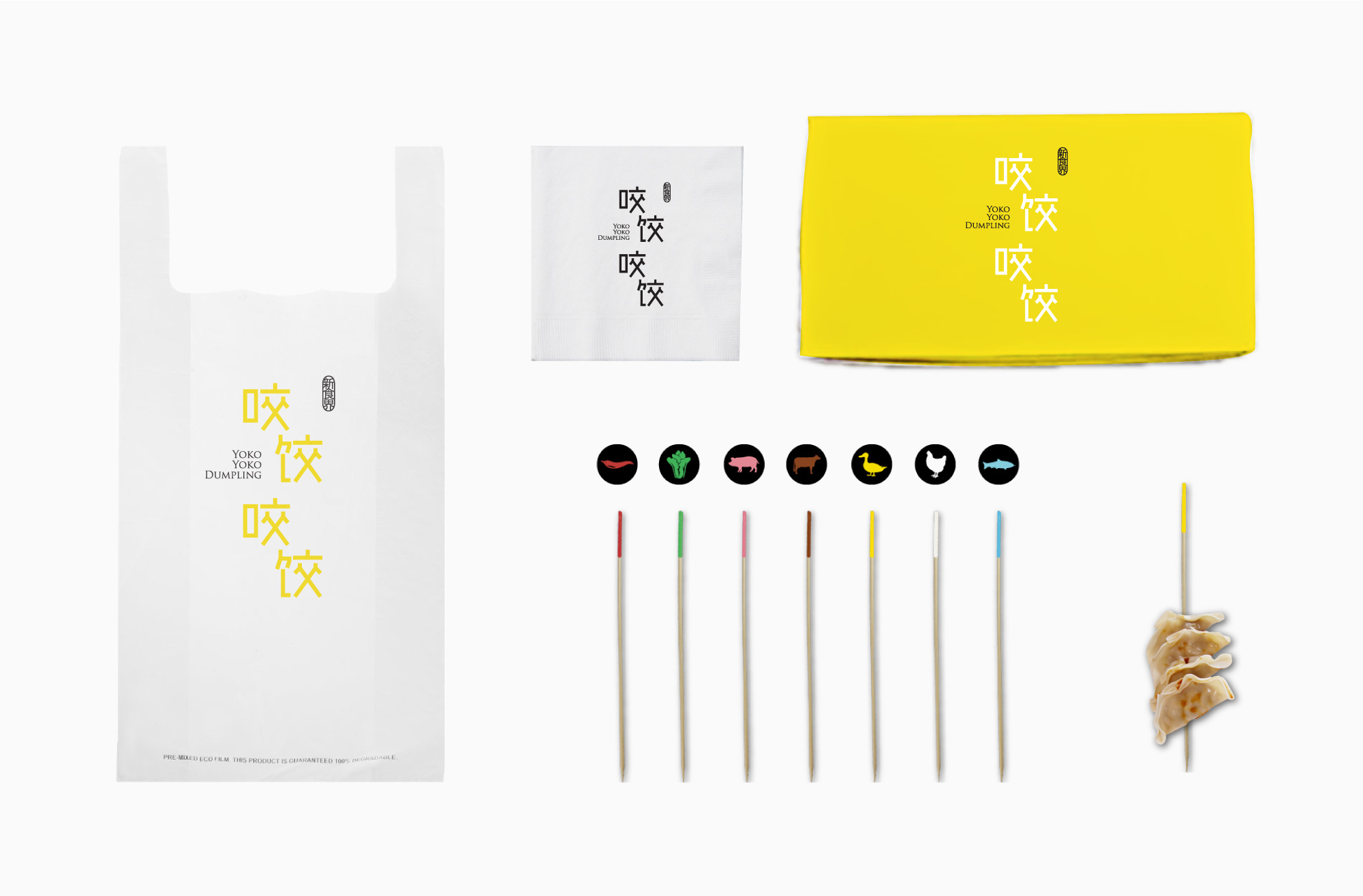
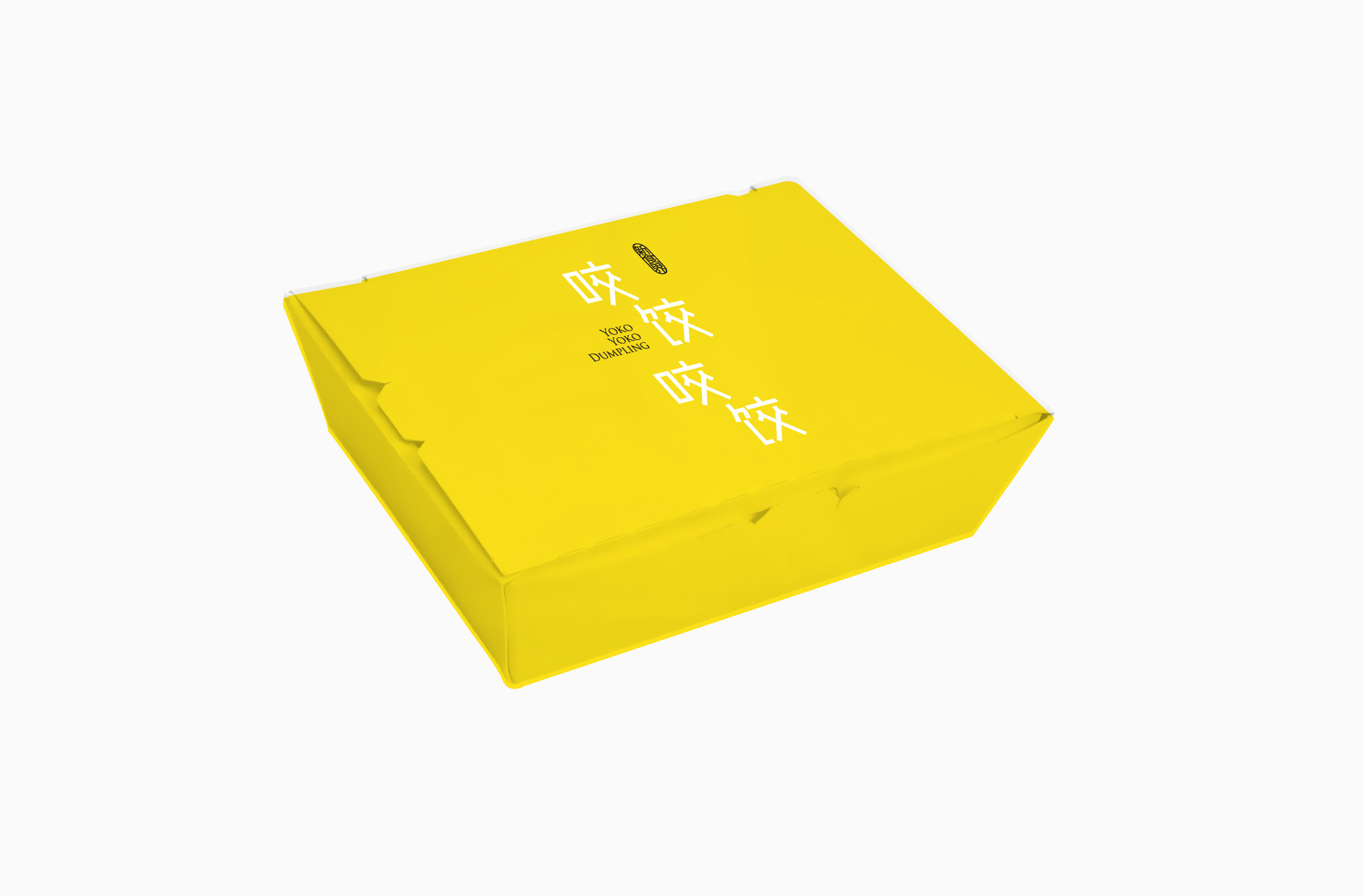
Lets Bite Dumpling Bite Dumpling! Derived from the Japanese pronunciations of the chinese words “咬饺咬饺” (yao jiao yao jiao; bite dumpling bite dumpling), Yoko Yoko is a fried dumpling brand presented to be both catchy and casual. The name shares the same pronunciations as “shake leg shake leg” in mandarin and we invite people to relax, bite dumpling and shake leg! Bright Yellow keeps the upbeat feel of the brand consistent while crisp and stick-like typography keeps the brand clear and simple.


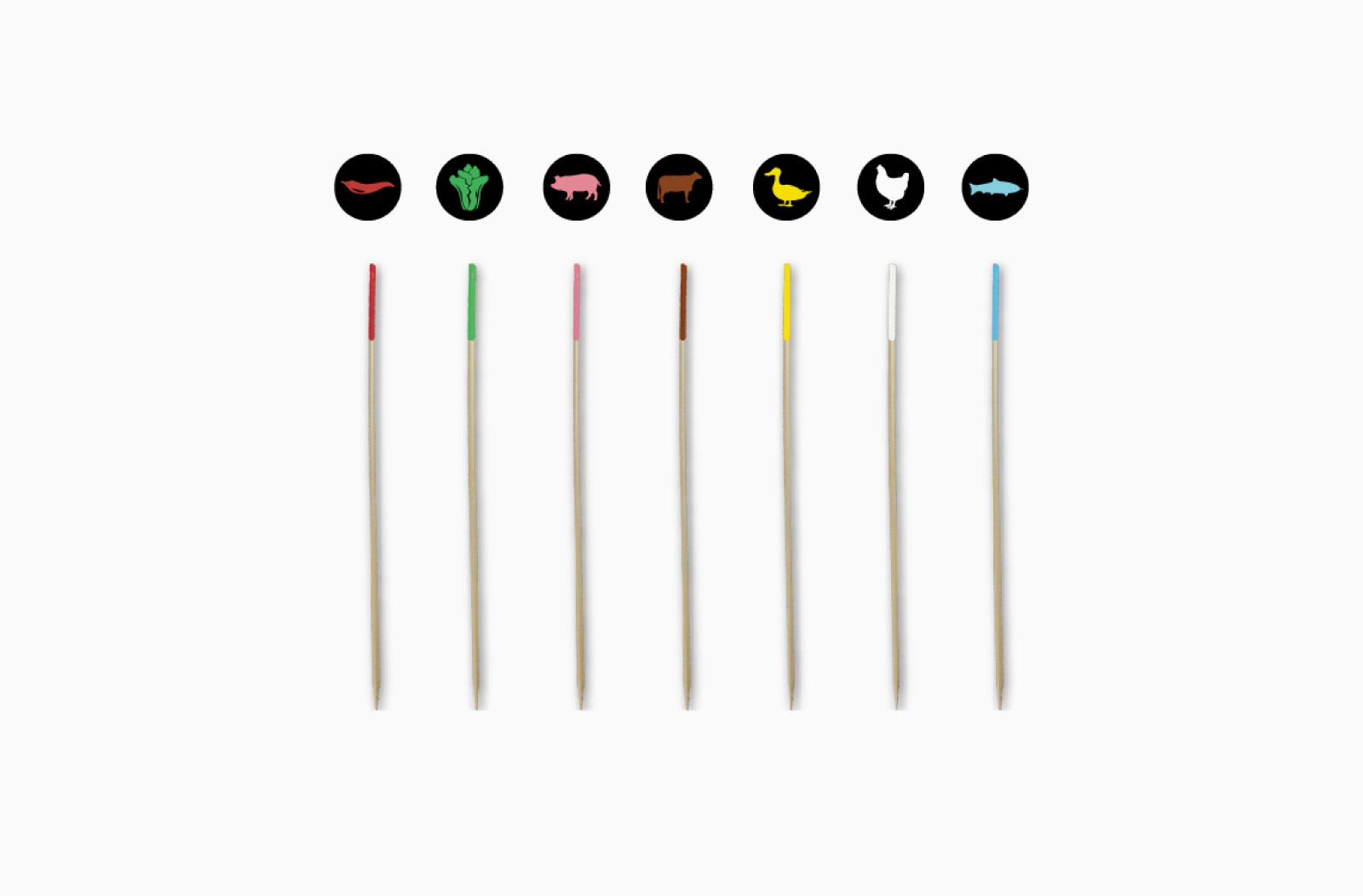
Colour-Coated Flavours


