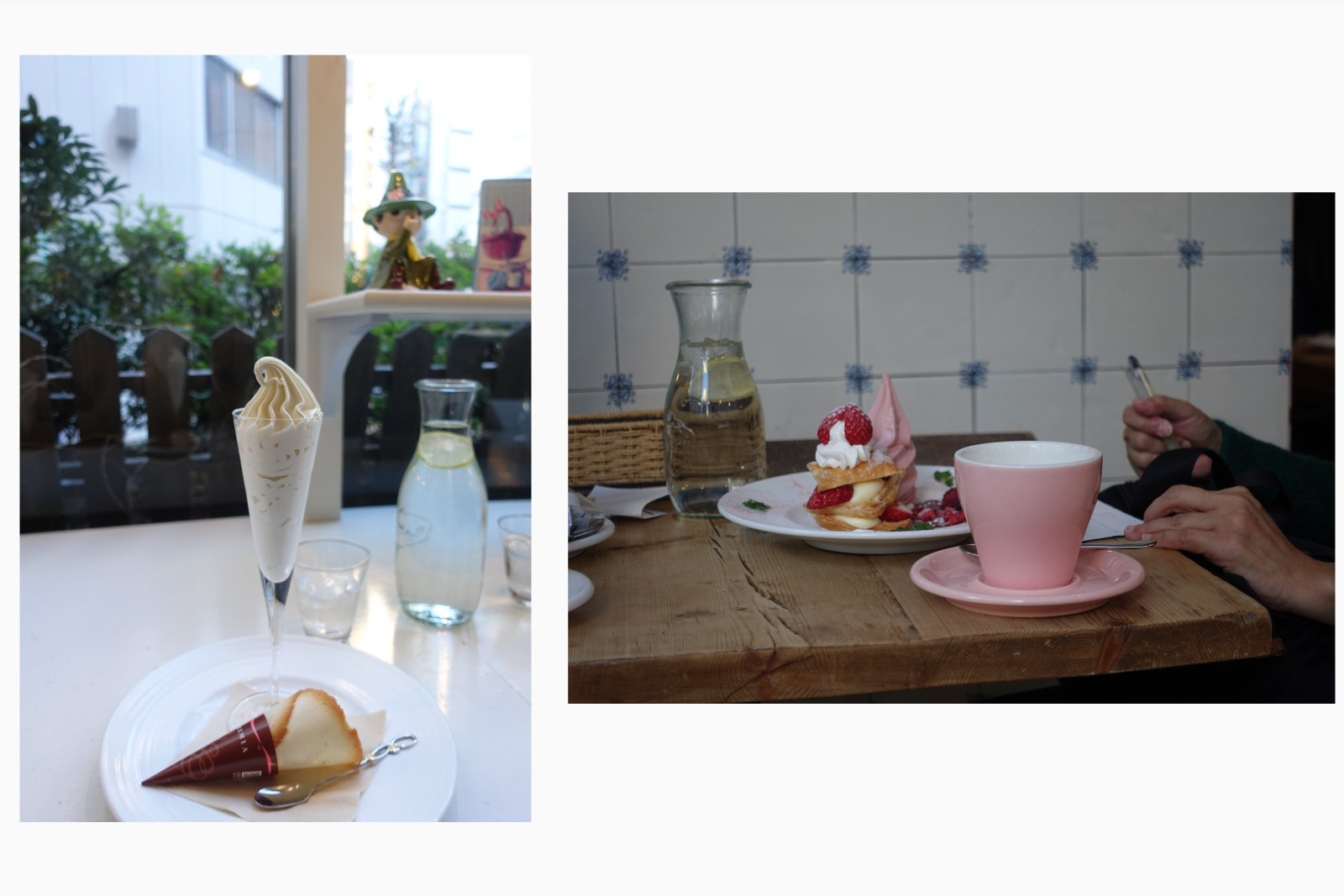
今回、写真でレストランのCaroline Dinerとカフェ兼文具屋のThink of Thingsをご紹介したいと思う。
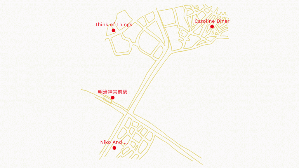
As a tourist, I really liked exploring the areas around Harajuku and Shibuya, but having lived here in Tokyo, I now prefer the area between the 2 near Meiji Jingu Mae station.
If you explore a little bit, you will find treasures sandwiched between residential areas.
Today, I would like to introduce the burger place “Caroline Diner” and a cafe/stationery shop “Think of Things” through photographs.
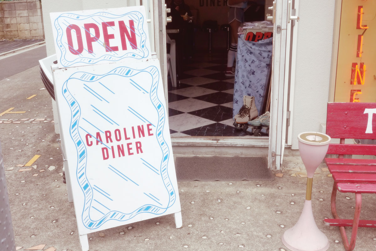
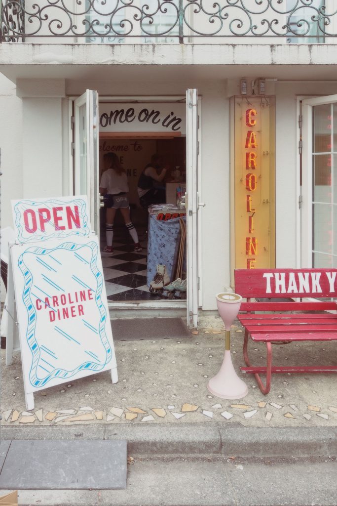
#1 A bit of Neon, a bit of American
Caroline Diner ★★★★☆ Address 2 Chome-14-11 Jingumae, Shibuya City, Tokyo 150-0001 Access 11 minute walk from Meiji-Jingumae Station Hours 12-6pm (rest on thursdays)
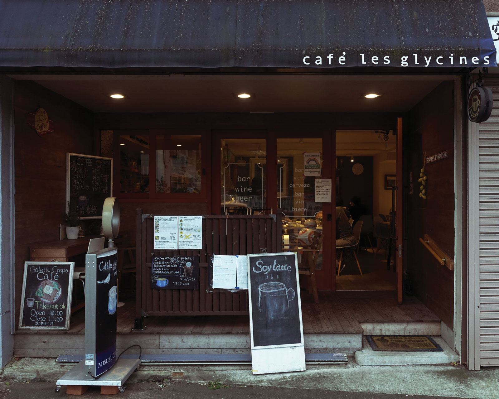
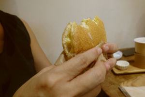
I really like neon signs, so I found this shops’s exterior fairly charming.It has an American vibe overall.
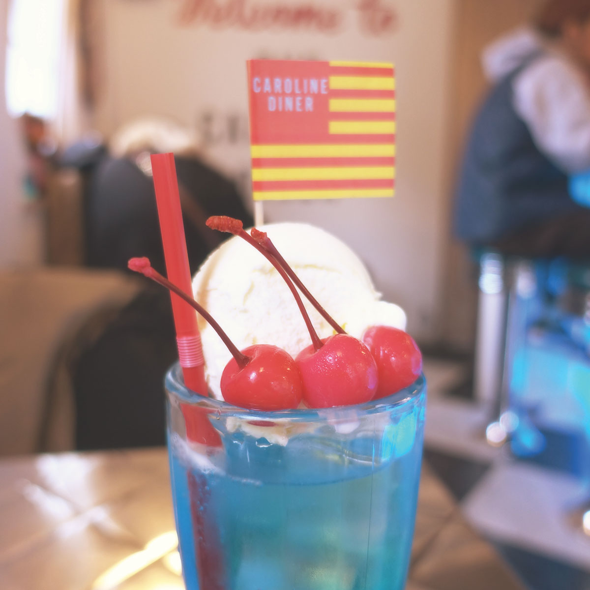
Whenever I ate birthday cake cherries, it is always the bright red fake cherry. However, despite have the same bright red colour, the one on the soda was a real one! It was a sweet surprise.
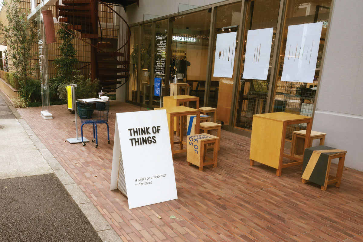
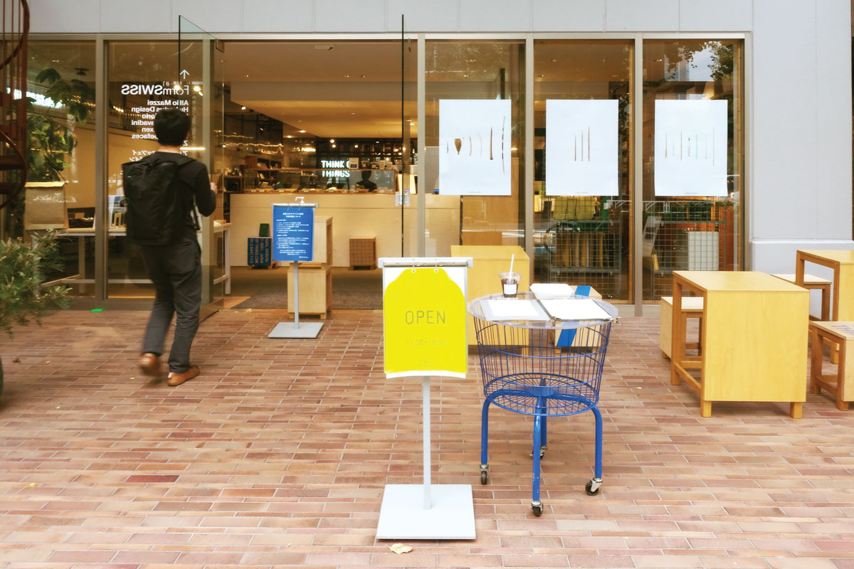
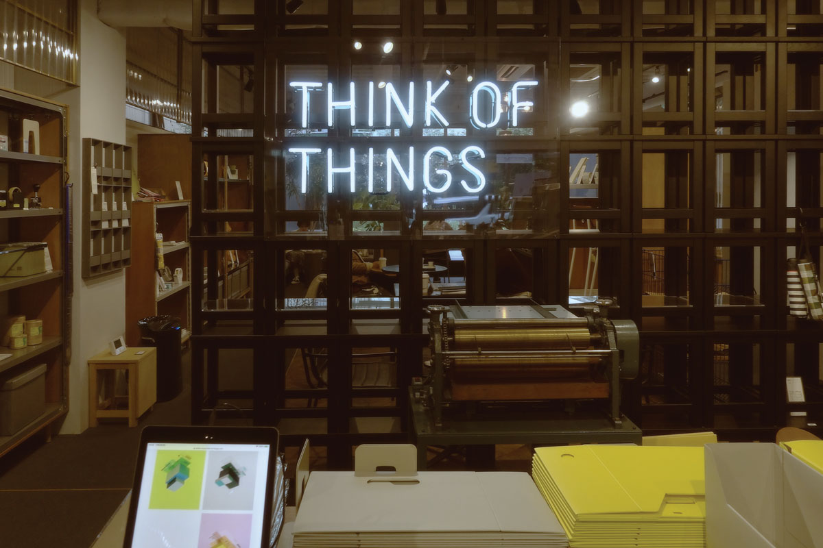
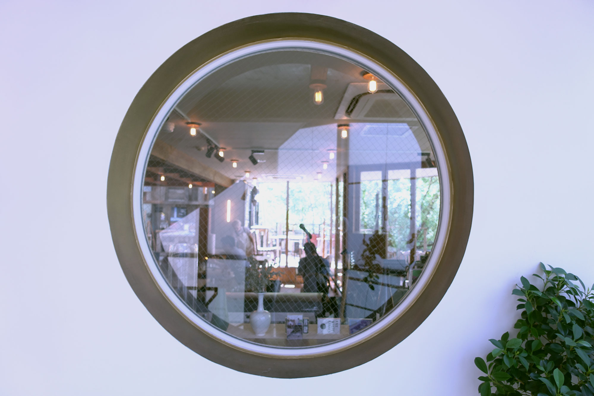
#2 Typography Nerd’s Cafe
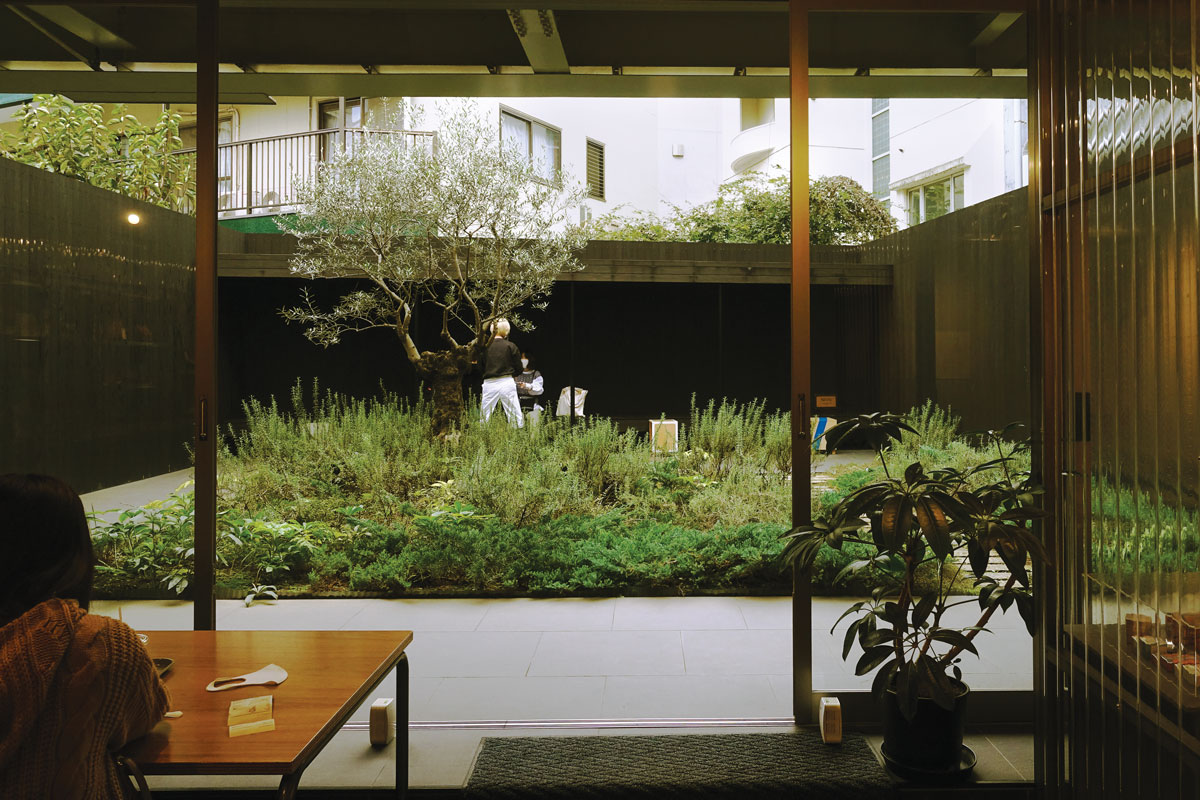
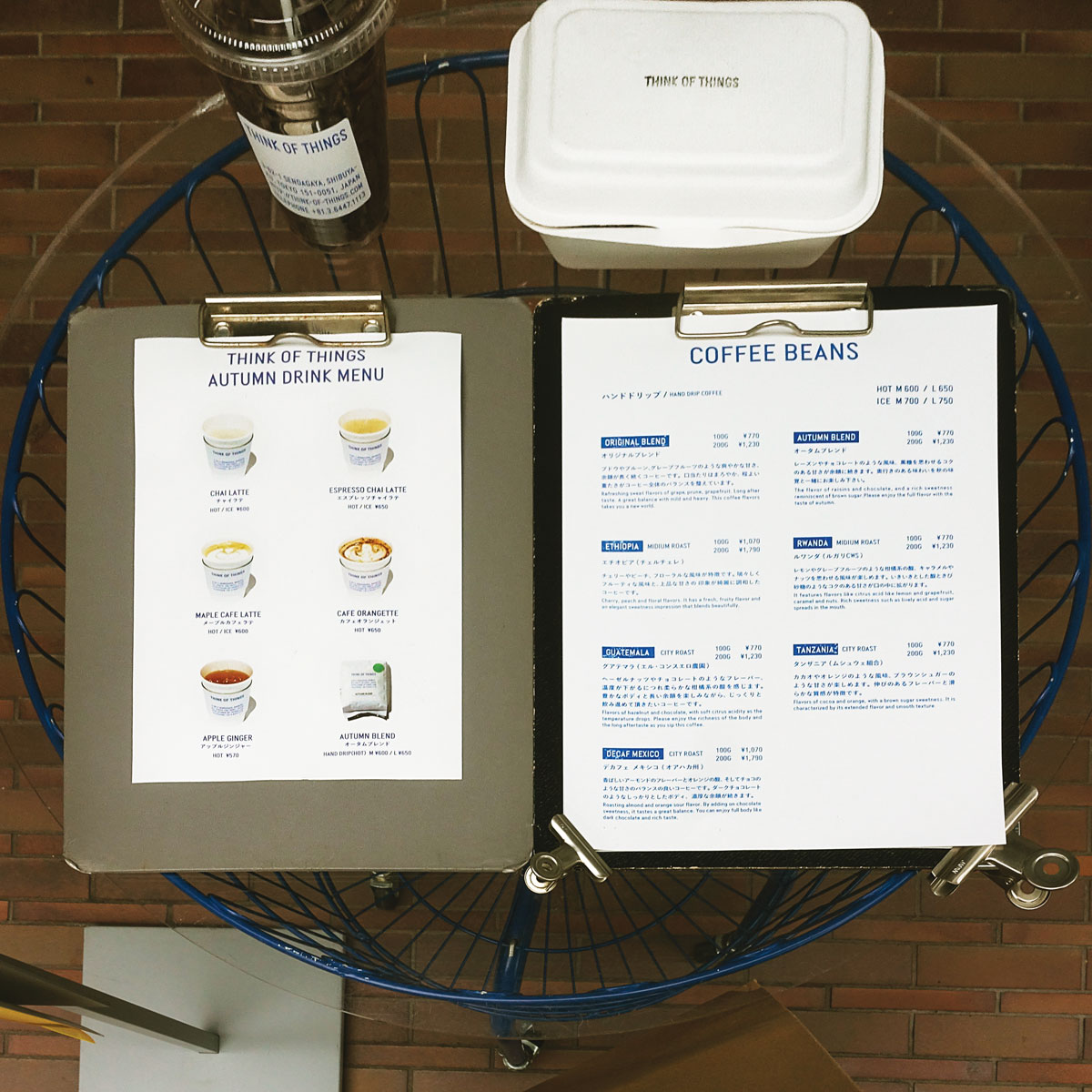
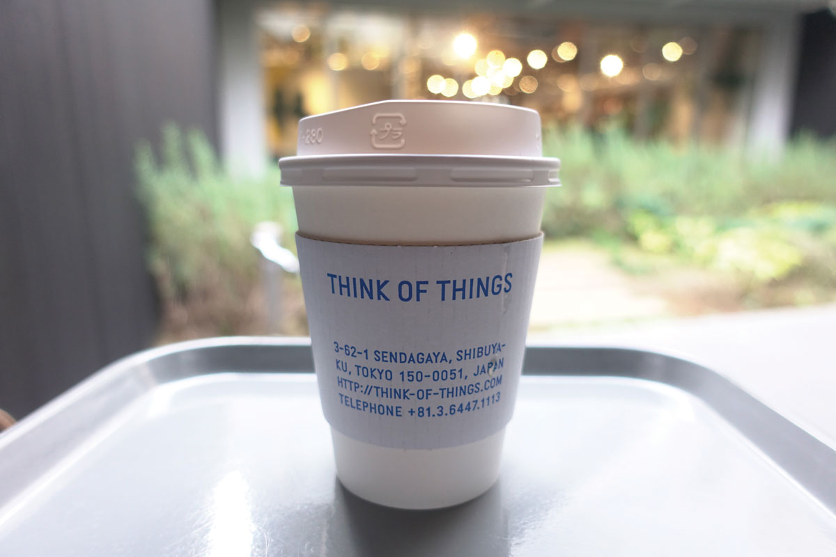
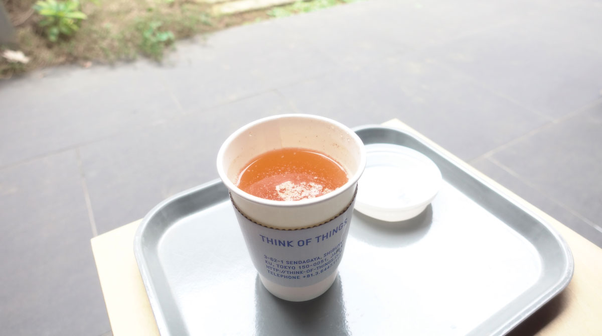
Think of Things
★★★★★ Address THINK OF THINGS、〒151-0051 Tokyo, Shibuya City, Sendagaya, 3 Chome−62−1 Access 5 minute from Meiji Jingumae
This is a stationery shop/cafe designed by JAGDA newcomer award winner Kanai Aki. The typography used in the shop is on point, it is a heaven for typography nerds.
They have small exhibitions from time to time as well as seasonal menu. This time I ordered apple ginger from their autumn menu. Its delicious with a generous amount of ginger!
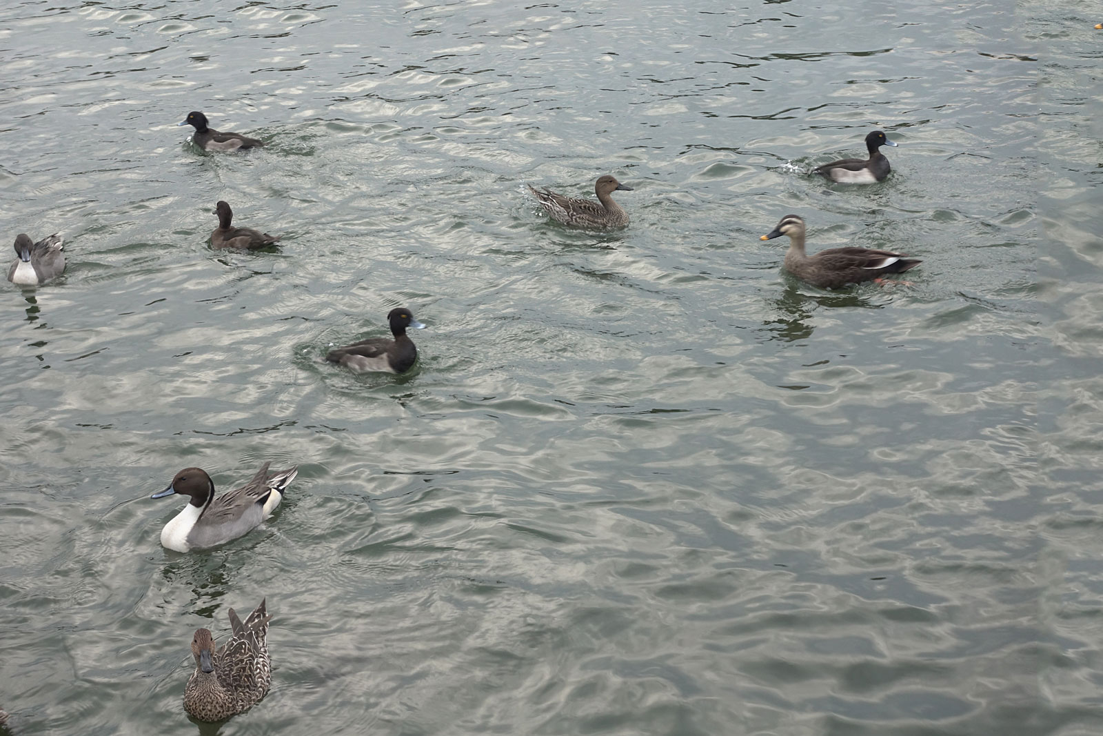
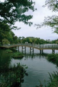
Along the Ikegami line which is connected to Oimachi line where I lived, there is a station called Senzoku Ike which translates to Senzoku Pond. It is one of those random stations I wanted to try to explore.
#1 Strolling inside an Ukiyo-e Painting
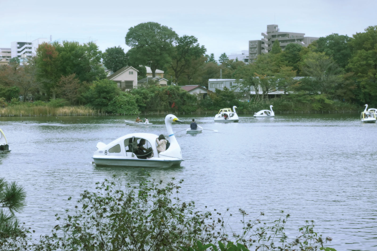
Senzoku Pond洗足池 ★★★★☆ Address 2 Chome MinamisenzokuOta City, Tokyo 145-0063 Access 6 minute walk from Senzoku-Ike Station Price サイクルボート(大人2人+幼児1人/30分600円) スワンボート(大人3人または大人2人+子供2人/30分800円) ローボート(大人3人/30分400円)
よく浮世絵に描かれた景勝地の洗足池にいると浮世絵の中にいるような感じがする。
散歩したり、写真を撮ったり、サイクルボードに乗ったりするなどもできる。
今回そこで撮った映像を浮世絵のように面白く編集してみた。
This pond has a long history and was often the subject of traditional ukiyo-e paintings, going there is like being in an ukiyo-painting.
You can stroll there, take pictures and ride cycle boats.
I took several videos and edited them like ukiyo-e paintings this time.
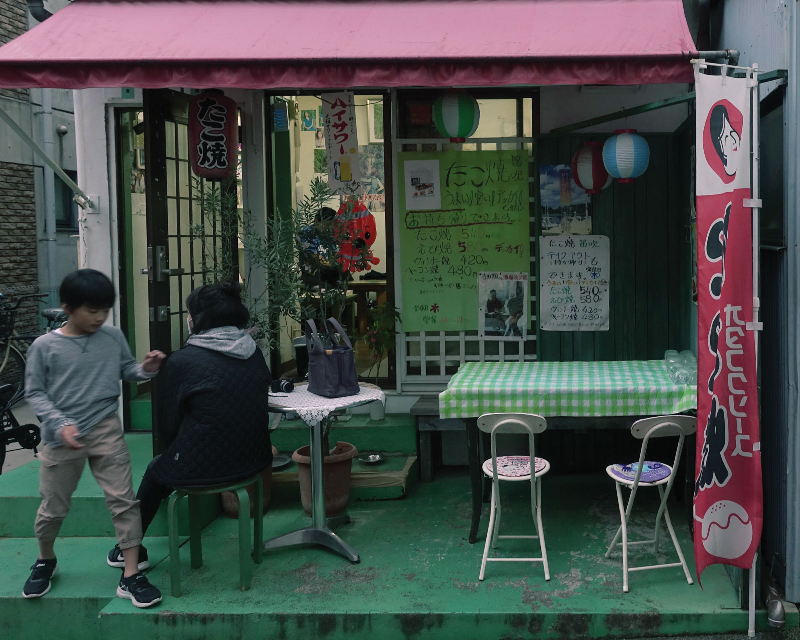
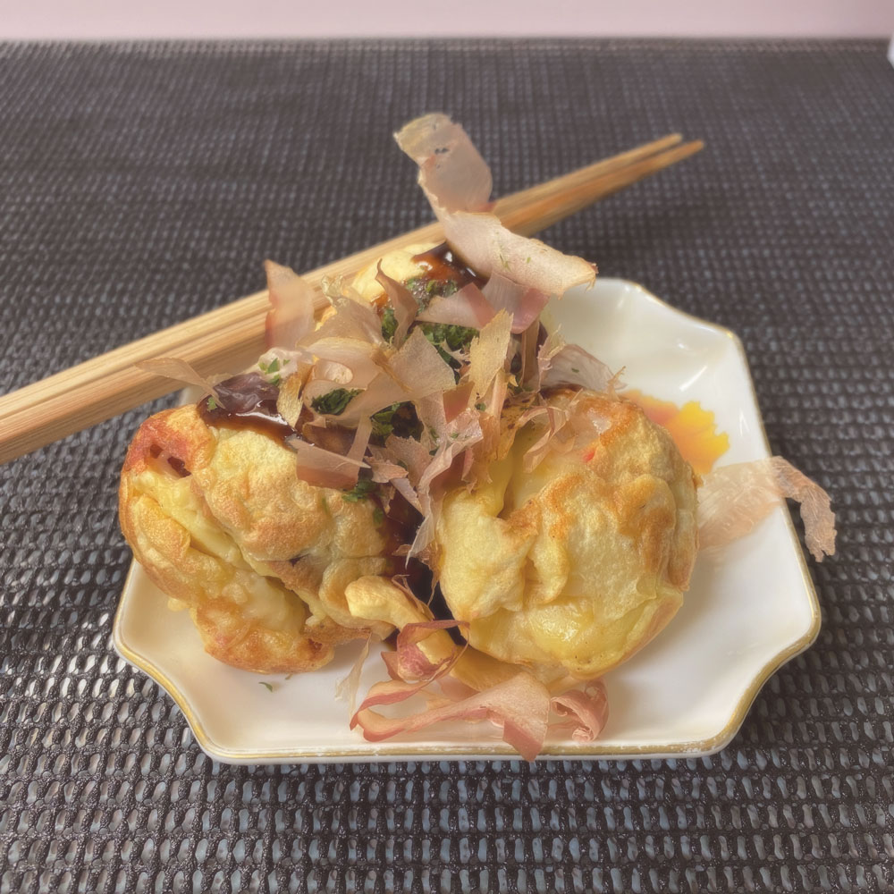
Fuefuki Senzoku-ike Shop (たこ焼き笛吹 洗足池店)
★★★☆☆ Address 〒145-0064 Tokyo, Ota City, Kamiikedai, 2 Chome−31−2 清泉ハウス Access 1 minute from Senzoku Ike Station
I read that this Takoyaki place is good on the internet and indeed it was. It was filled with magazines it got featured on, it was a humble retro-looking place. It would be perfect if you takeaway from here and munch on while sitting on a bench overlooking the pond.
Another lesser known place I fancy. Shimotakaido. Its in the same ward I live in, Setagaya, but I still need to take the train for around 45 minutes to get there. It’s a peaceful place to spend a day especially with the 3 spots I will introduce, they are all within a minute walk from the station. You could catch a morning movie at Shimotakaido Cinema, have lunch at Sakahon Soba and get a haircut at Barber Sakota right after. 🌞
The interesting thing is that I got there by a train line called the Setagaya Line that is rather different from other lines. Firstly, you get on by tapping your card on the train itself rather than the gantry outside(except for the terminal stations). Next, it is smaller in size, like a tram or a bus and if you’re lucky it will travel backwards from where your seat is facing. Its weirdly fascinating to see the sceneries of Setagaya moving backwards haha. 🚃
DISCLAIMER* The opening times might be affected by the covid-19 pandemic.
The first place I would like to introduce is an independent cinema simply known as the Shimotakaido Cinema. The building itself is rather pure-looking and unlike a usual cinema, the interiors are a little old-fashioned and a little cute too😎
Firstly they bring in interesting foreign films that major cinemas do not carry and they also put on certain japanese cult classics from time to time. As you can see in my photos, it only cost a whopping 1000yen on the “cinema day” Doesn’t it have indie vibes? Anyway its a decent place. 🎥 Note that no food allowed though. 🍿
#2 Soba with Nostalgic vibes
Sakahon Soba Noodles さか本そば店
★★★☆☆ Address 4 Chome-45-16 Akatsutsumi, Setagaya City, Tokyo 156-0044 Access 1 minute from Shimotakaido Station
Hours
Mon-Sun: 9:00~21:00; closed on thursday
This was recommended by a writer of a magazine as well. It has a wide selection of soba and I got one with some mochi in it! I never had mochi back in my home country, even if it was Japanese cuisine, it wouldn’t be included in the menu. Thus, I took the chance and went for it~it was chewy and melting! 🍜
The shop owners are old and the place is old; but I like it all the same. In fact it is the nostalgic showa retro vibes that make it special. Note that there is no English menu, only go if you know some Japanese.
I was looking for haircut recommendations in Popeye magazine and most had astronomical prices. The most reasonable one I saw was Barber Sakota–they go only by reservation, no walk-in. If it’s just cutting, its 3000yen and an additional 1000yen for a wash. In an interview, the owner mentioned that if the customer left it up to him to decide the haircut, he would look at the customer’s shoes to decide what kind of person he is; to decide on his cut. 💈
The place had a cozy modern+mid century interior, I like the smell here more than most salons. My hair was cut by the disciple rather than the owner and it was intricate; the hair wash was great too! My scalp felt minty and fresh after the massage! 💆♂️
I have thankfully made it to year 2 safely which brings me to another post where I share random models and sketches. Once again, I come to document my progress in the subject I literally have the worst results for–Expression, which is about drawing/painting. I am really really bad at drawing and painting by hand as compared to the local Japanese kids. Its really… bad. Therefore I want to reiterate that this post is not to show good skills but for documentation like a diary such that I can compare my progress as I work towards the future.
#1 Modern Tokyo Ukiyo-e
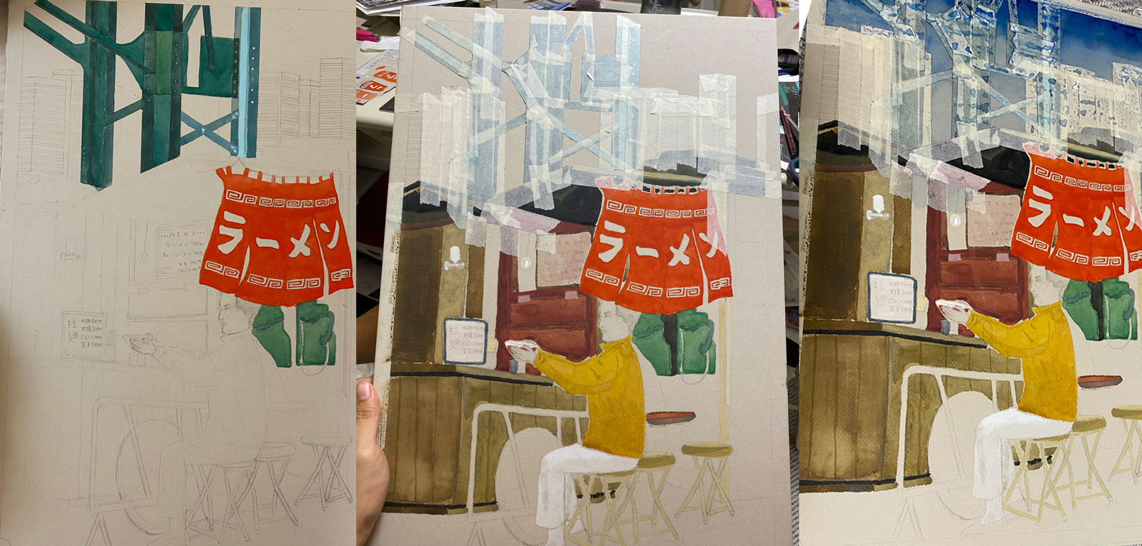
Our first assignment is to paint a modern interpretation of traditional japanese wood-cut illustrations known as ukiyo-e. I had to research various renowned ukiyo-e artists and it was really interesting. Ukiyo-e has an intentional flat sense of space, interesting use of gradations as well as outlined elements.
I composed my shot using a humble ramen stand against the backdrop of Tokyo Skyscrapers. Upon reflection, I realised I should have used thinner lines in some parts and take care of the proportions of the man more carefully.
#2 Aluminium Can Sculpture
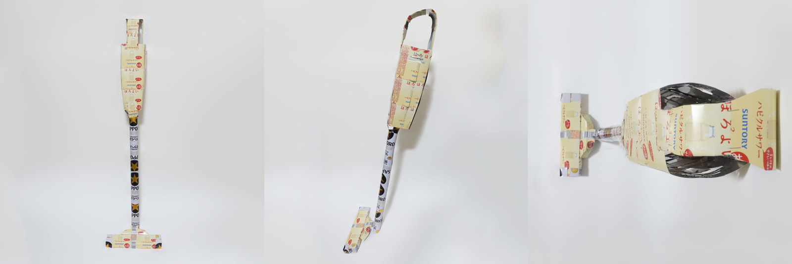
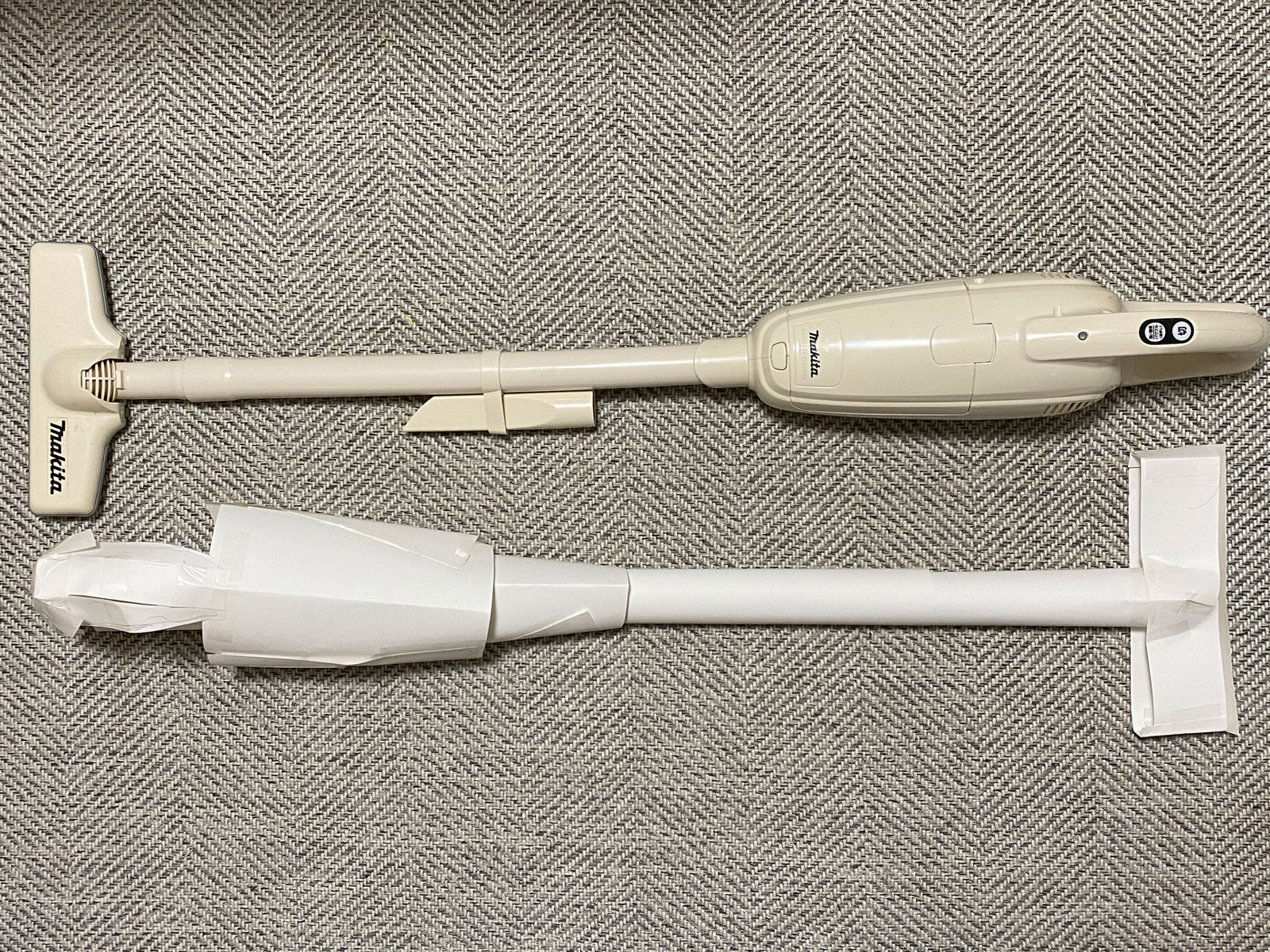
The second assignment is making sculptures out of soft drink cans. I chose Sapporo Beer and Horoyoi cans to form a vacuum cleaner. I really like my Makita vacuum cleaner and I modelled its shape based on it. It is important to make paper mockups. In the end there are many rough parts and the top is not sealed but I learnt a lot in the progress.
#3 Food Stop-motion Sketches
I am supposed to explore the interaction between 2 objects with this assignment. My main subject is bread with butter, sausage and ritz sandwich as secondary subjects. I tried to do something special with each–Sausage spins of the x-axis but the bread responds by rotating in the y-axis; The Ritz Sandwich rotates together with the bread crusts tearing off like a switch; The butter unmelts as the bread gets toasted.
Wes Anderson’s new film The French Dispatch’s trailer came out a while back and it was spectacular. It brought me back to 2013 when I watched his film for the first time. The Grand Budapest Hotel. At that time the poster looked cute and I decided to casually give it a watch without much thought, a common tendency of mine.
At the end of the 2+ hours, I found myself quickly searching for the film’s art director on my smartphone. I was floored–I have never seen such visually detailed movie before, every frame was like a painting.
I think it started at around 10 minutes into a film where there was a scene with a shoe shine boy being so compositionally perfect despite being only shown for a second. I was hooked from that point on. In this article, I would like to talk about 3 points on why this film is a masterpiece, even though there are many others.
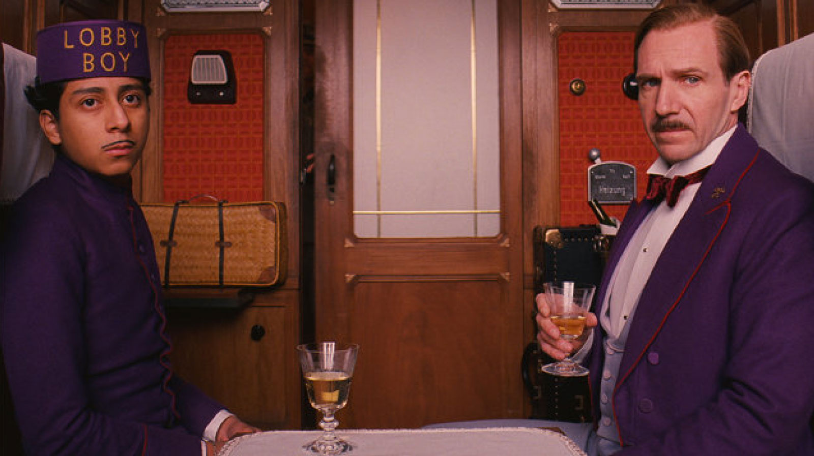
(TOP) The main characters of the film, Zero (left) and Gustave (right). (上) 映画の主人公、ゼロ(左)とグスタフ(右)
★ Outline / 概要 ★
It is a story centered around an extravagant hotel in Europe in the 1930s with the main characters, Gustave H, the concierge of the hotel and, Zero, his protégé and lobby boy. Gustave would soon be wrongly framed for a murder, driving him to go on adventures to escape and prove himself with the help of Zero throughout the film.
(Clockwise from the left) Passport, stamps and currency notes from the fictional country of Zubrowska (左から) 虚構の国「ズブロフカ」のパスポート、切手、紙幣
The film is brimming with many beautiful, intricate props that most people would not bat at eye at. However, a point that the audience should know to appreciate the film more is that every little prop is handmade to fit into this fictional world–Every advertisement, every piece of note in the background, every item.
(ABOVE) Several newspaper designs shown very briefly in the film (上) 新聞のデザイン
A great example to highlight this is the Newspaper. Even though the Newspaper only flashes for moments, every word in its articles are written by the director himself and laid out to reflect the world of that time. In fact, it went through over 40 revisions to reach its final state, its almost as if the 2 seconds of the film with the prop is a tale on its own.
(ABOVE) How a Mendl’s packaging opens up (上)「Mendl’s」というお菓子店のパッケージの開け方
Another prominent prop is the packaging for Mendl’s, a lovely sweet shop in the world of Zubrowka. Of course, it has nice lettering and a lovely shade of pink but the key is in the way it opens up. When you pull the ribbon, the box flips out dramatically on all 4 sides seamlessly to reveal the beloved dessert adorably standing in the middle. The fact that they considered even the movement of the prop reflects how seriously they take their prop-making.Re-creating the fictional universe to such intricacy is often said to be for the actors. It helps them immense in this illusion, it is kind of like how actors/actresses image background stories for the roles beyond the script to mould the character more realistically. A good example is the currency and the stamp used in the Grand Budapest, you have even the portrait of the imagined King of the fictional world and the country’s very own crest.
(ABOVE) Further beautiful examples of the Mendl’s brand identity seen in various scenes (上)「Mendl’s」のブランドアイデンティティーが見える様々なシーン
★ #2 Take your references seriously • 参考の緻密な再現 ★
(1)A comparison with a 1908 image of a Hotel in Cairo with similar inconsistencies in letter spacing.
タイトルの字間の少し不規則ところを1900年代カイロにあったホテルとの比較 (2)A group picture of the Grand Budapest Hotel staff with some employees taking a half-knee and some sitting with their legs slanted.
片膝についたり、斜めに座ったりしたなど職業によって姿勢をするグループ写真 (3)A beautiful painted background
水彩で塗られた背景
Everything seems natural or obvious in Wes’s fictional world but everything is researched, debated and designed.
For example in the masthead of the movie poster, you can see that the kerning (or spacing between alphabets) is off in some areas. You would think that it is a mistake but it is actually the genius of Wes. The team underwent intense research into the European hotels of that bygone era. An old steel hotel sign from the 1930s Cairo was especially picked out as it had many spacing errors blacksmiths often commit in the process of making the letterings with the tools then. They replicated these errors intentionally even if it might seem like a mistake on their part–there is soul in these things.
There are many other occurrences that seem natural initially but unique on a second look–Such as the very intentional half-knee pose when taking the photograph. I also love the painted backgrounds, very much like the hand-painted sets in old films and theatre. Usually they would seem cheesy in this day and age but they merge beautifully with the rest of film’s universe.
★ #3 The framing and blocking of things, characters and places • 物、人、場所の位置と大きさ ★
(ABOVE) The changes in aspect ratio according to the time period shown (上) 画面の縦横比は時代によって変わる
The physical design of the places and things are only the tip of the iceberg. Wes has also put in considerable effort in the arrangement and framing of these things.
The aspect ratio of each scene changes according to the time period that it reflects. In the beginning–supposedly the modern age–the standard 16:9 ratio we know of today is used. However, when the author recalls back to the 1968, the aspect ratio changes to the widescreen ratio 2.4:1 of the 50s and 60s. Furthermore, when the main character further recalls back to 1932, the 4:3 squarish ratio used by black and white films of that time is applied.
On a closer look, the positioning of the character is also linked to its development in the story. A disciple and lobby boy at the start, Zero mostly appears in the background while his teacher, Gustave is usually at the front, big and close to the camera. However this changes at the pivotal scene where Zero saves Gustave to which he said “we’re brothers” From that point on, they are equals and they began to be shown on equal levels and equal sizes. This is very similar to how they divide the stage in 9 sections in theatre for different uses.
Today, I only cited one of the many masterpieces of Wes Anderson because there is just too much to talk about. Every of his film has a soul, a time, a place and a feeling of its own. “Rushmore”–has a romance towards prestigious private schools and the plethora of extracurricular activities(even eccentric ones) “Life Aquatic of Steve Zissou”–has the fascination towards the deep sea and nautical culture. “Moonrise Kingdom”–has references to cartography and an adoration for the world of boy scouts. If you haven’t watched them, please do yourself a favour and immense yourself in the spectacular world of Wes Anderson.
今日、ウェス監督の映画の中の一つしか言及していないが、言えることはさらに無数にあるのです。彼の映画ごとに、独特な魂が潜んでいる-自分ならではの場所、時間、雰囲気など。 “Rushmore”– 風変わりな様々な部活動と豪華な私立学校へのロマン。“Life Aquatic of Steve Zissou”-航海のカルチャーと深海への冒険。“Moonrise Kingdom”–地図作成オタクとボーイスカウトのキャンプの世界。これらの映画は絶対に観る価値があります。
DISCLAIMER☞The writing and content have seem odd during the attempt to draw a parallel between my limited Japanese ability and English expressions. This is for my practice, let me know areas of improvements thanks. Special thanks to my Japanese teacher, Naoko.
There is something about less known places that is very charming. Perhaps it’s the feeling of being detached from the rest of the world. Feeling completely on our own in this world. Perhaps its the isolation that makes it perfect for quiet contemplation. Perhaps it’s the sense of discovery when you open a door and out pours unfamiliar music, scents, lights.
There are many such places in Japan, they call it “隠れ家”, which means hideouts of refuges. I think many of such hidden spots do not really want much tourist and are rarely found on english guides. I have no problem with bustling areas, they are cool as well. But I think it would be interesting to document some of such places with varying degrees of mystery.
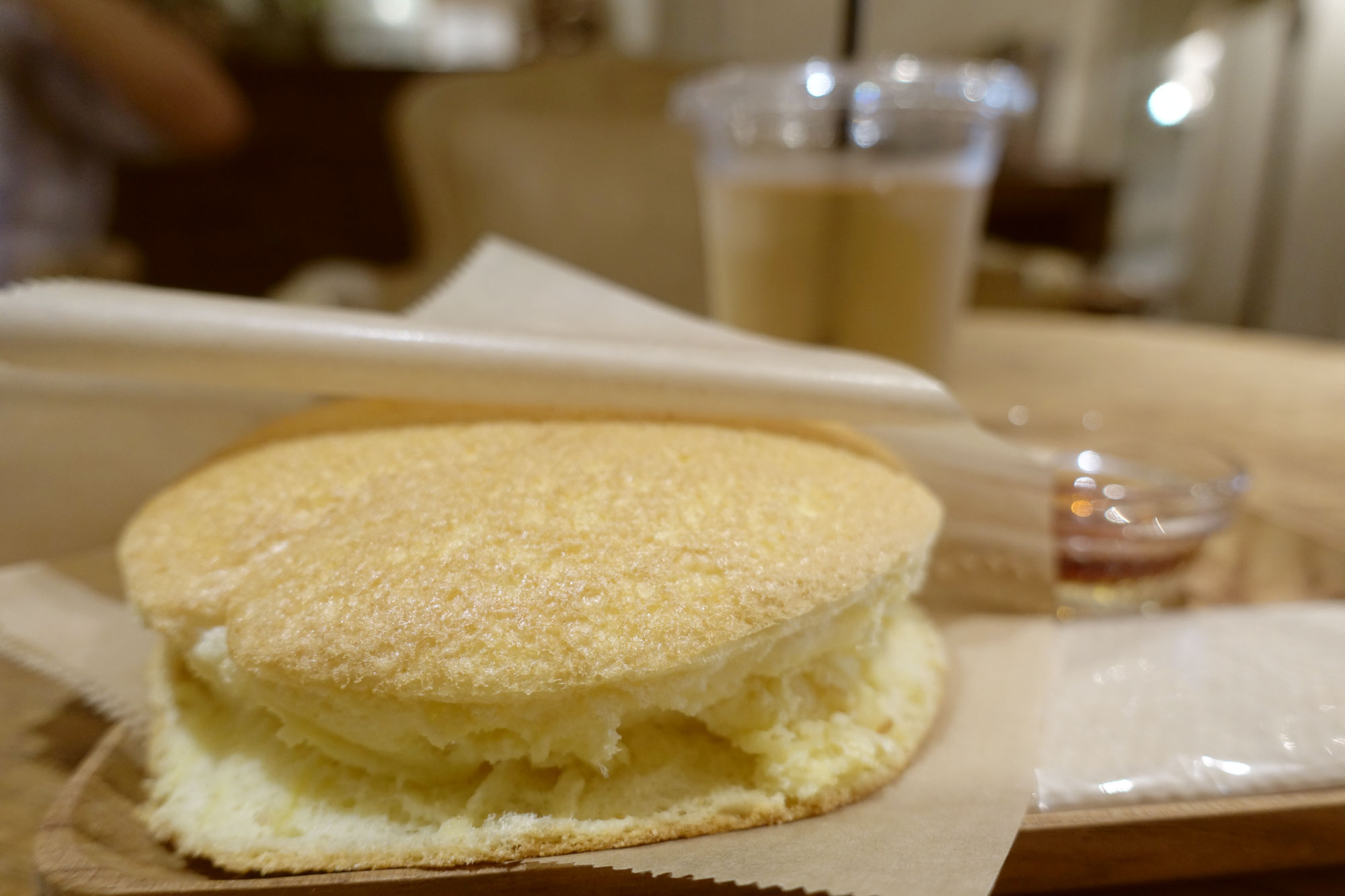
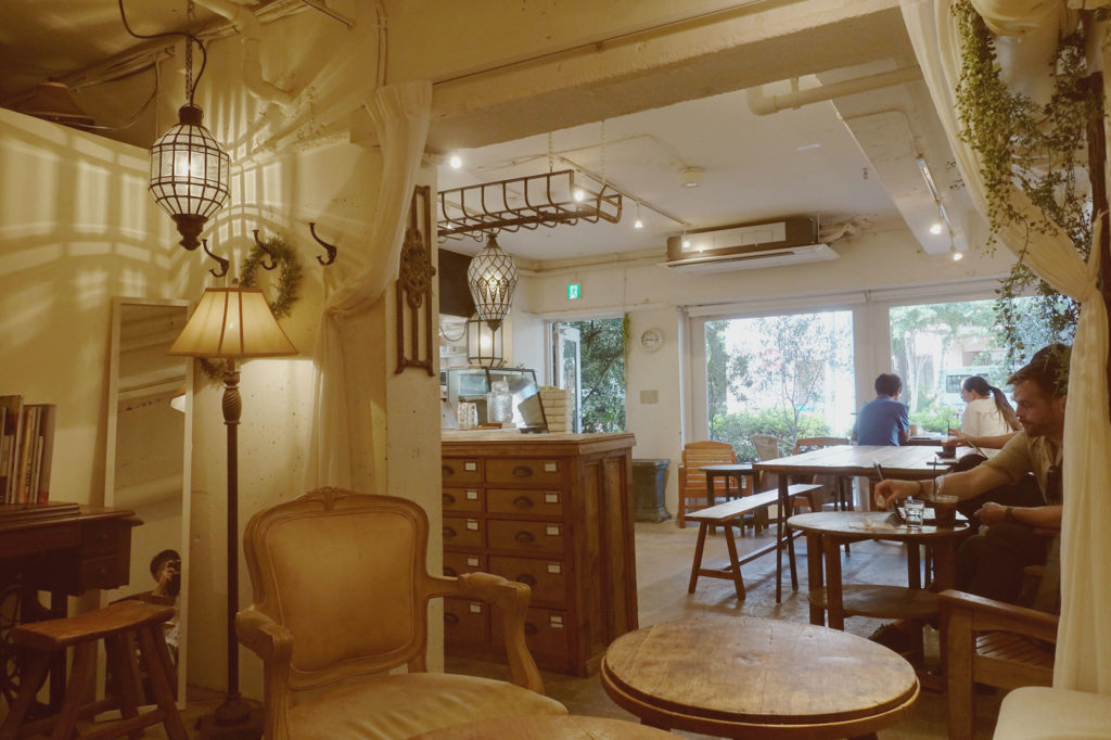
A lot of the places I find are from a Japanese magazine that I really like. Popeyes. The magazine for city boys. As they like to put it. Check it out, it is really amazing. The first area I would like to talk about is not really too secretive but I highly doubt it is anyone’s first choice to explore, even many locals have not been there. However, if you go at early hours, walk off road to explore, there will be gems. The area is Shirokanedai(白金台)! In Japanese it means platinum street, as the name suggests, it is an affluent neighbourhood. I would like to introduce 3 places that I stumbled upon by personally exploring, from the magazine or online.
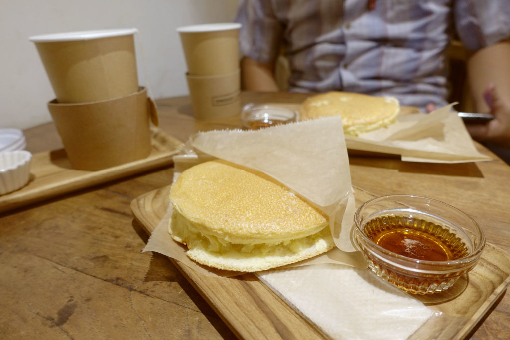
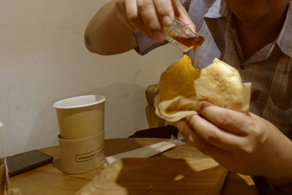
First is a cafe called ‘Shirokane Lounge’ that closes at 9:30am, you heard that right! You better go early or you might miss the opening hours of 630am ~ 930am. It is a picturesque cafe in a highly affluent neighbourhood but the real catch is their 500yen pancake sets. I can guarantee it is not your usual pancakes, it is thicker but also unlike the thick pancakes that is trending in Japan. It has a slightly eggy taste and you eat it with your hands. The fact that it pairs with decent tea in a beautiful setting for such a nominal price makes it the most satisfying breakfast. You have to walk along a park and playground before you find this interesting establishment. Coupled with the opening hours, it was by no means crowded and really felt like a refreshing hidden spot.
*When I wrote the draft this was still open, but unfortunately it is not permanently closed, so you can consider this a document of what could have been
Hours
Mon-Sun: 10:00~18:00; They are usually on off every 2nd and 4th Wednesday of the month, but do check their website for changes as times like summer vacation period do not apply the same way.
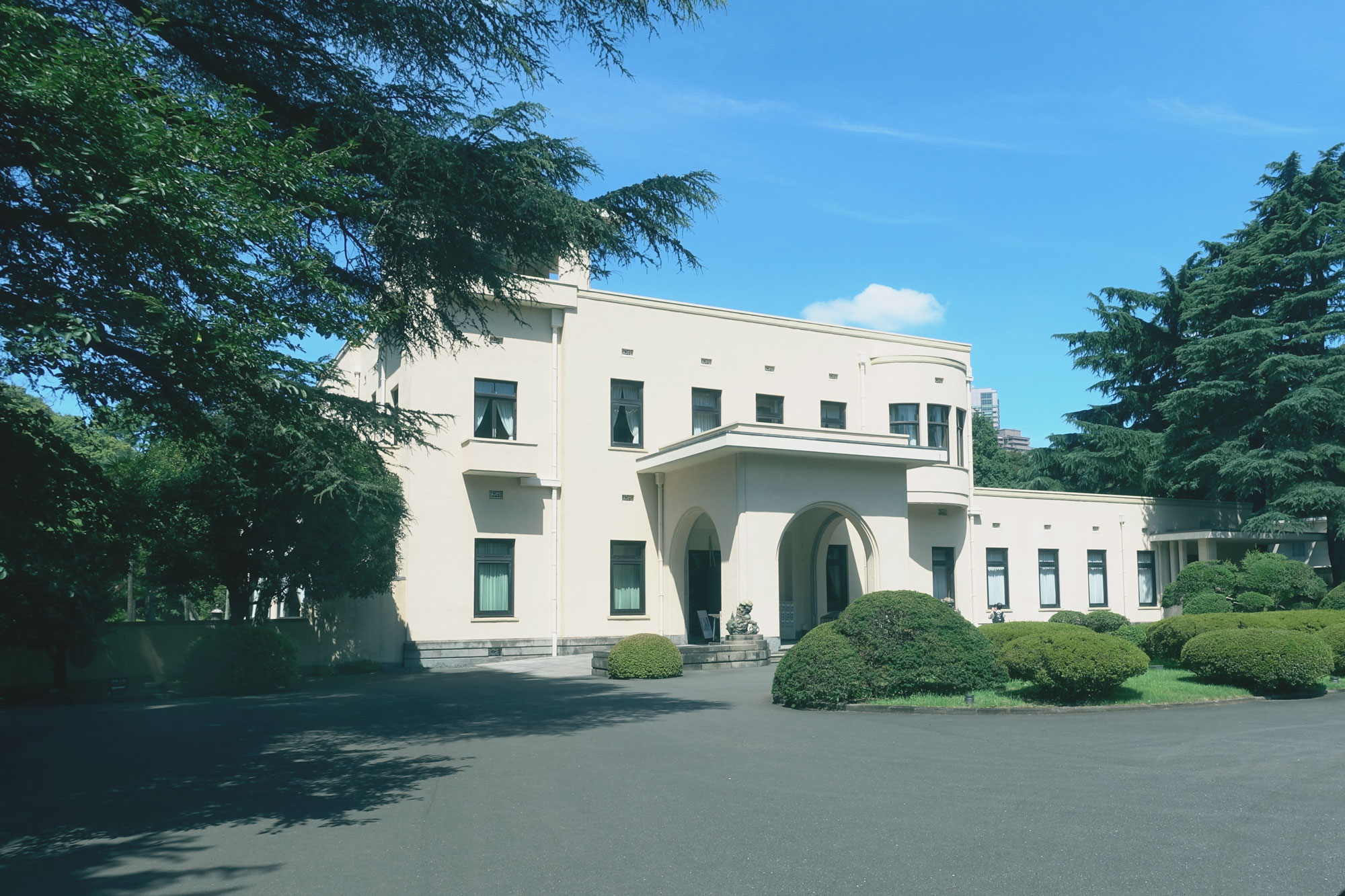
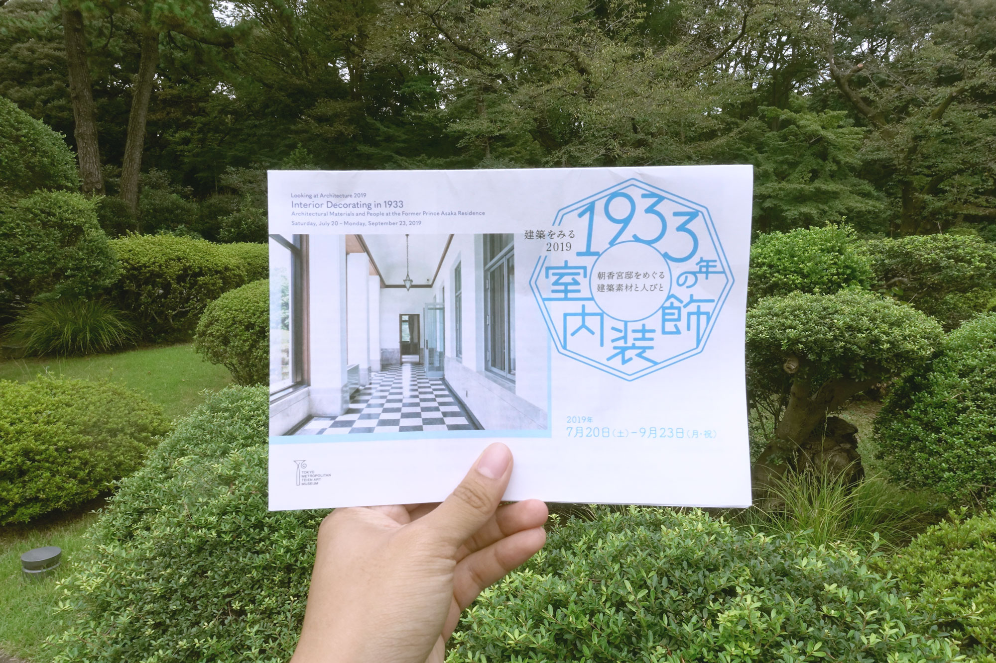
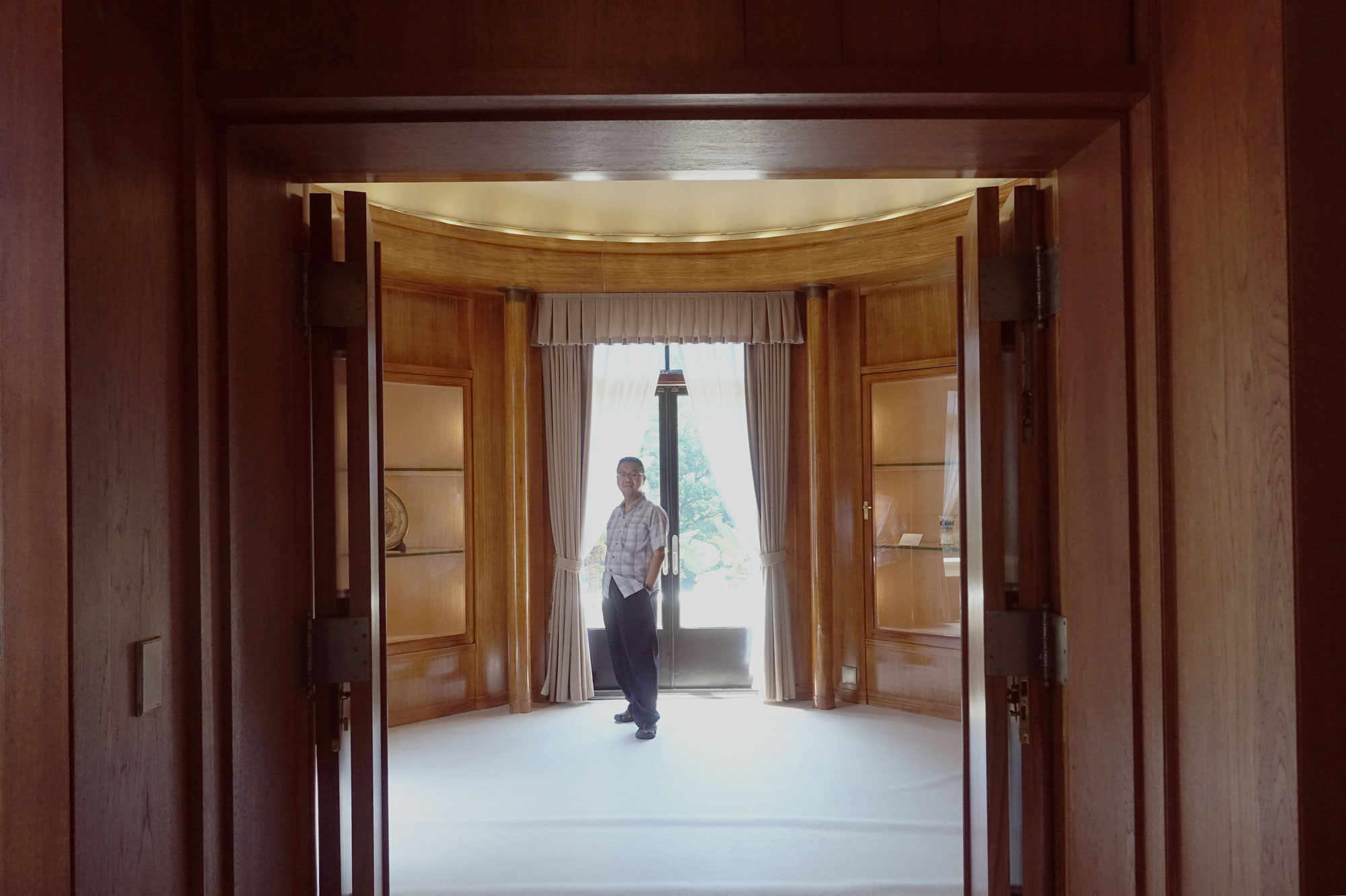
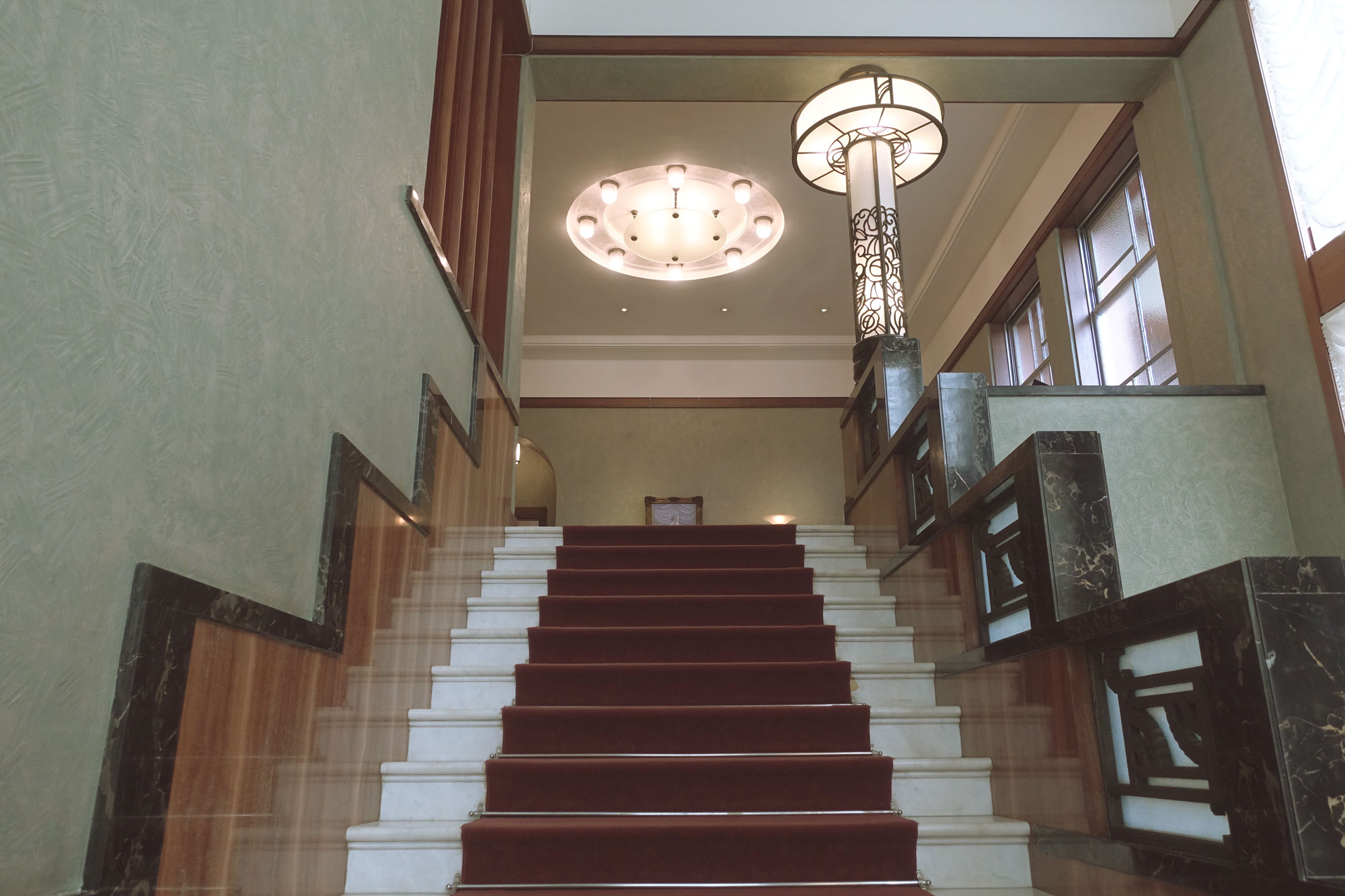
This is a hidden spot, in a true sense. It is an instituition concealed in the middle of a beautiful garden. It looks like a palace from the Art Deco era and it should, it was the residence of Prince Asaka Yasuhiko and his family since 1933. This was built after the prince who studied in France and travelled to the United States got entranced by the Art Deco movement, then at its peak, in the 1920s. It was then built by a panel of architects who travelled to the Paris Expo, the forefront of the Art Deco style, to research and design the iconic architecture with hints of Japanese traditions. I strongly recommend anyone into design and culture to visit this place even if the exhibition on is not interesting, because the interior architecture itself is literally one of the best Art Deco example you can see today.
When you arrive to the gate of the gardens which is in the middle of nowhere, you can’t get a hint of how cool the place is. My father was already suggesting that its not worth it to go in. But after pushing to get us in, he also realised it would be a big mistake not to go in. It is like you are in a movie, living in the luxury of another era. This is not your everyday museum and is a well-kept secret. I found out about it in a tiny column of Popeye’s magazine that featured a reader’s no.1 favourite spot in Tokyo.
The exhibition on at that time is coincidentally about “interiors of 1933” where they replicated how the Prince’s house looked in its original glory. It felt very Wes Anderson, I liked the arrangements, textures, lightings and even the tiny motifs designed. There is also an absolutely classy café in the museum’s extension, I did not dare to enter but I spot some fancy cakes and a full glass view of the beautiful garden outside.
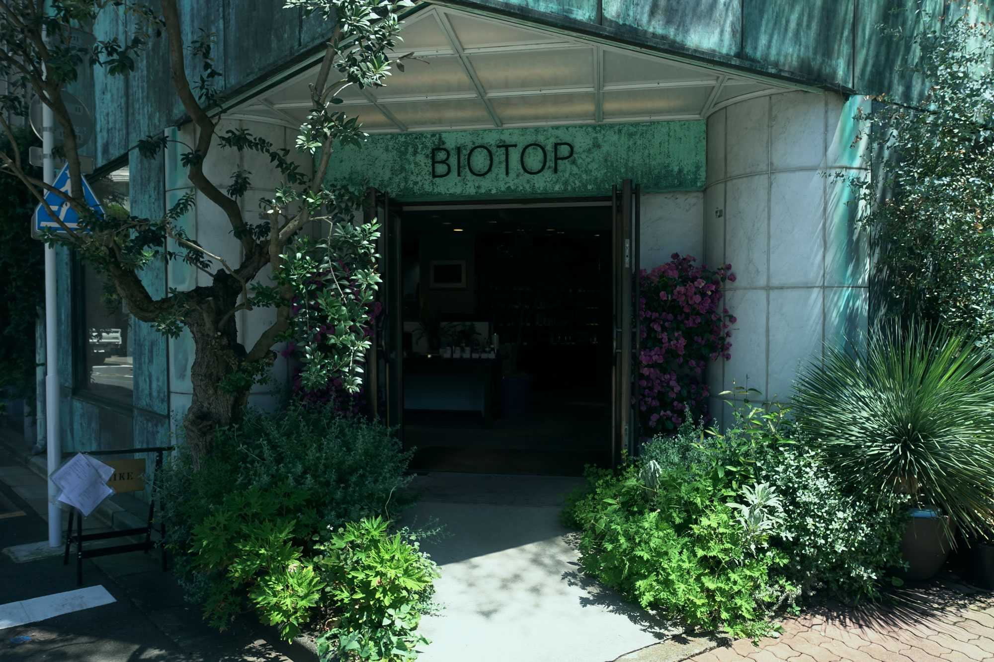
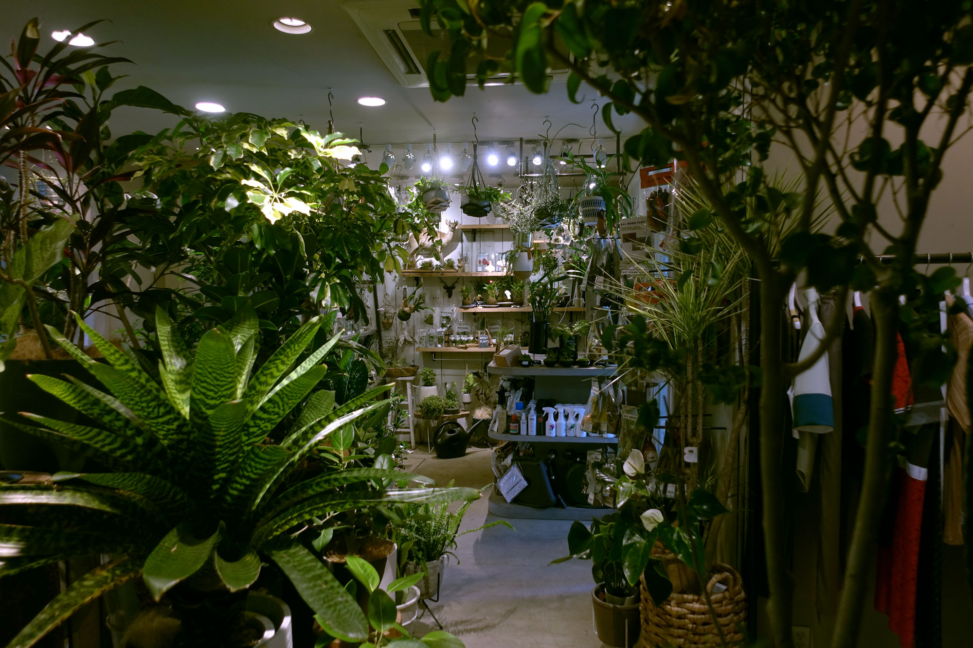
#3 treehouse magic
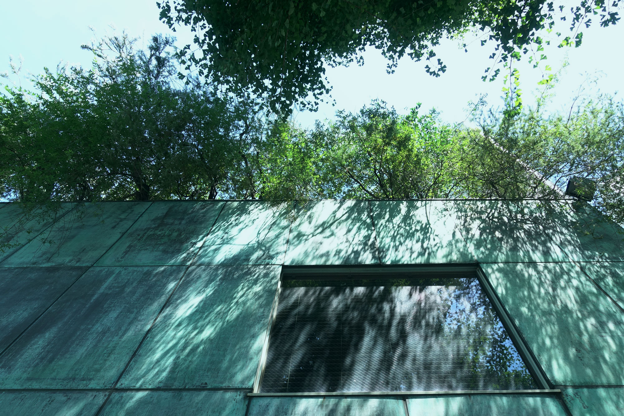
Biotop Nurseries ビオトープ
★★★★☆ Address 4 Chome-6-44 Shirokanedai, Minato City, Tokyo 108-0071 Website https://www.biotop.jp/ Access 8 minute walk from Shirokanedai Station; 7 minute from Shirokane Lounge; 12 minute from Teien Tokyo Metropolitan Art Museum
Hours
Mon-Sun: 11:00~20:00
I found this place after googling Shirokanedai area. It is a green rusty building that looks like it is overtaken by plants. Apparently there’s a treehouse according to the website I found this on, but I did not go. It is supposed to look like a secret base for adults where there is a guestbook you can leave a message in. I did however visit the 3 main floors of this building. The first floor includes plants, planting and gardening tools and even cosmetics. The second floor is a stylish clothing store, probably carrying not-your-usual brands. The third floor is a restaurant which is the highlight, I will discuss this place separately in the following portion. Overall this is an interesting place with a greenhouse-like interior and exterior. You can take some nice pictures which I did–for my parents.
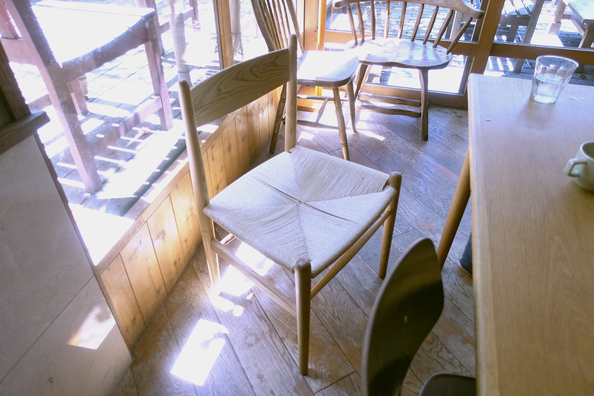
#4 avant-garde bourgeois cuisine
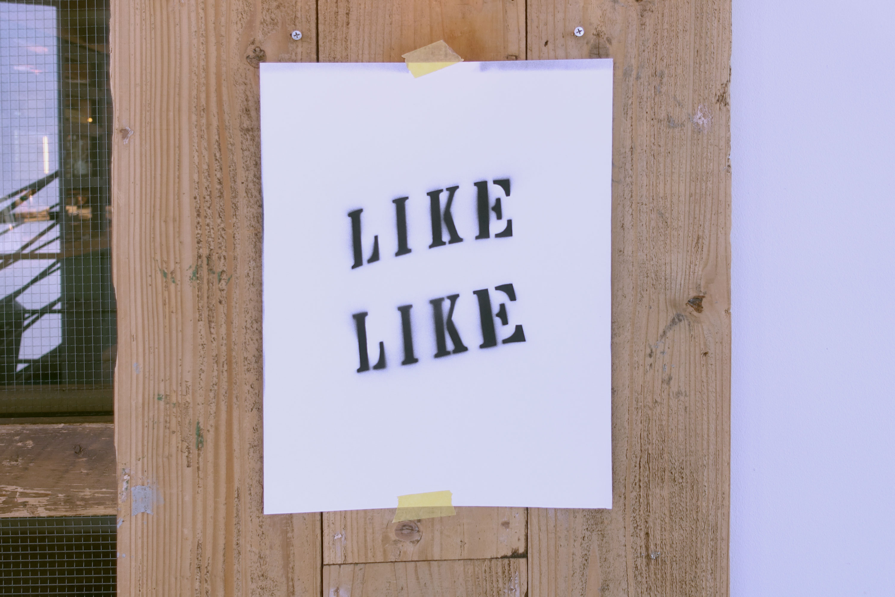
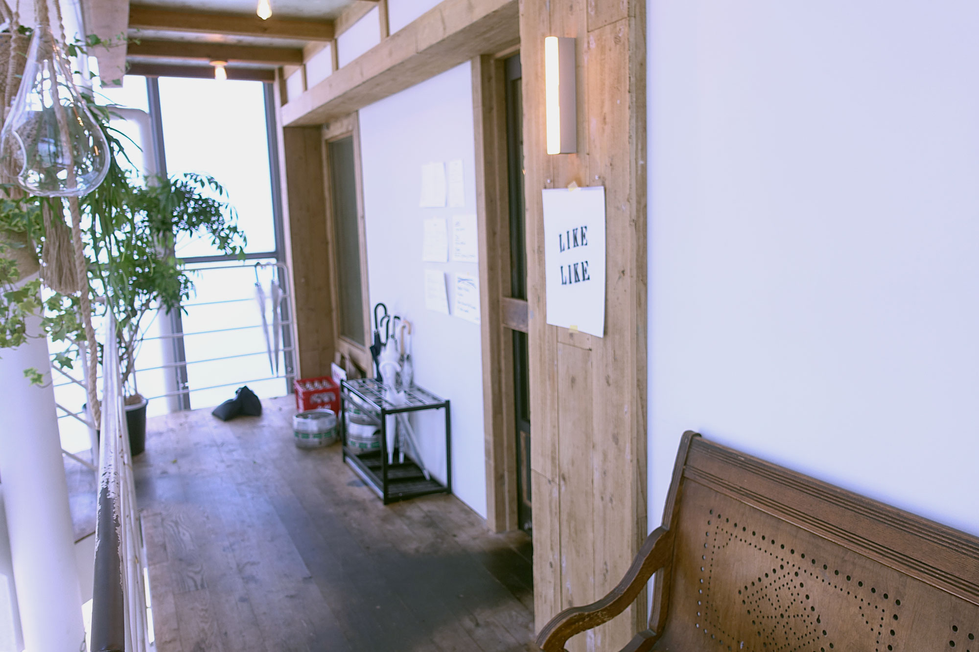
LIKE ライク
★★★☆☆ Address 4 Chome-6-44 Shirokanedai, Minato City, Tokyo 108-0071 Access 3rd floor of Biotop
Hours
Mon-Sun: 11:30~23:00; Off on Mondays and every second and fourth Sundays
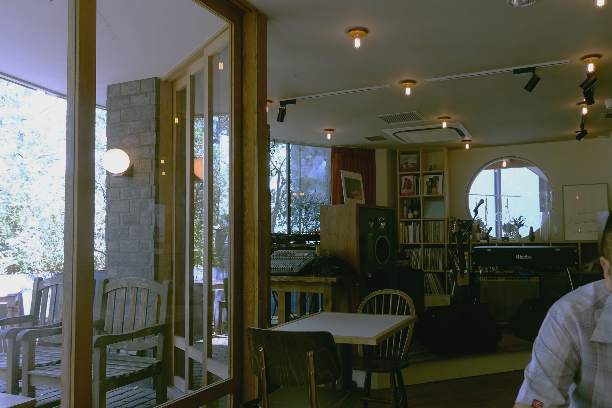
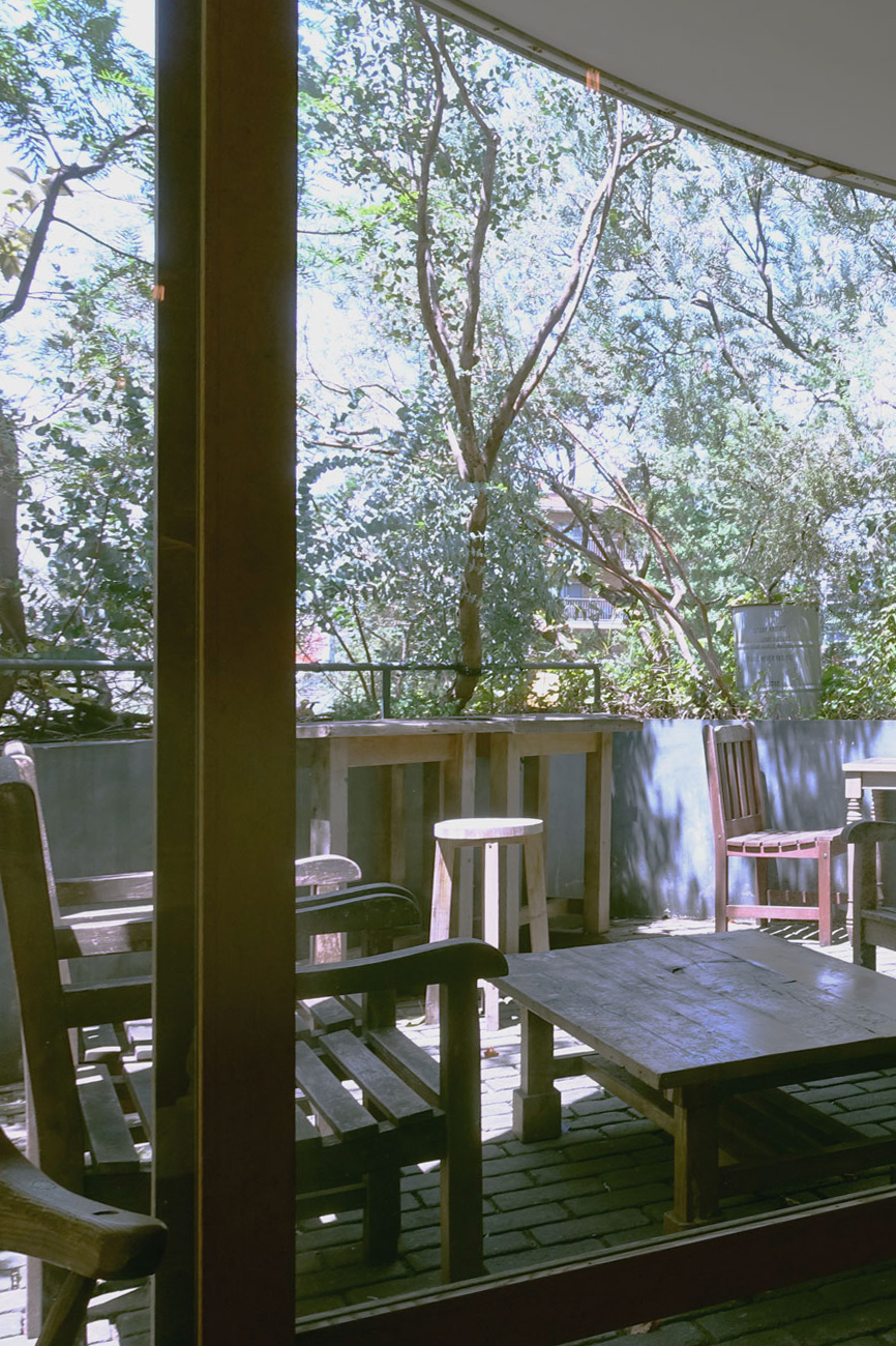
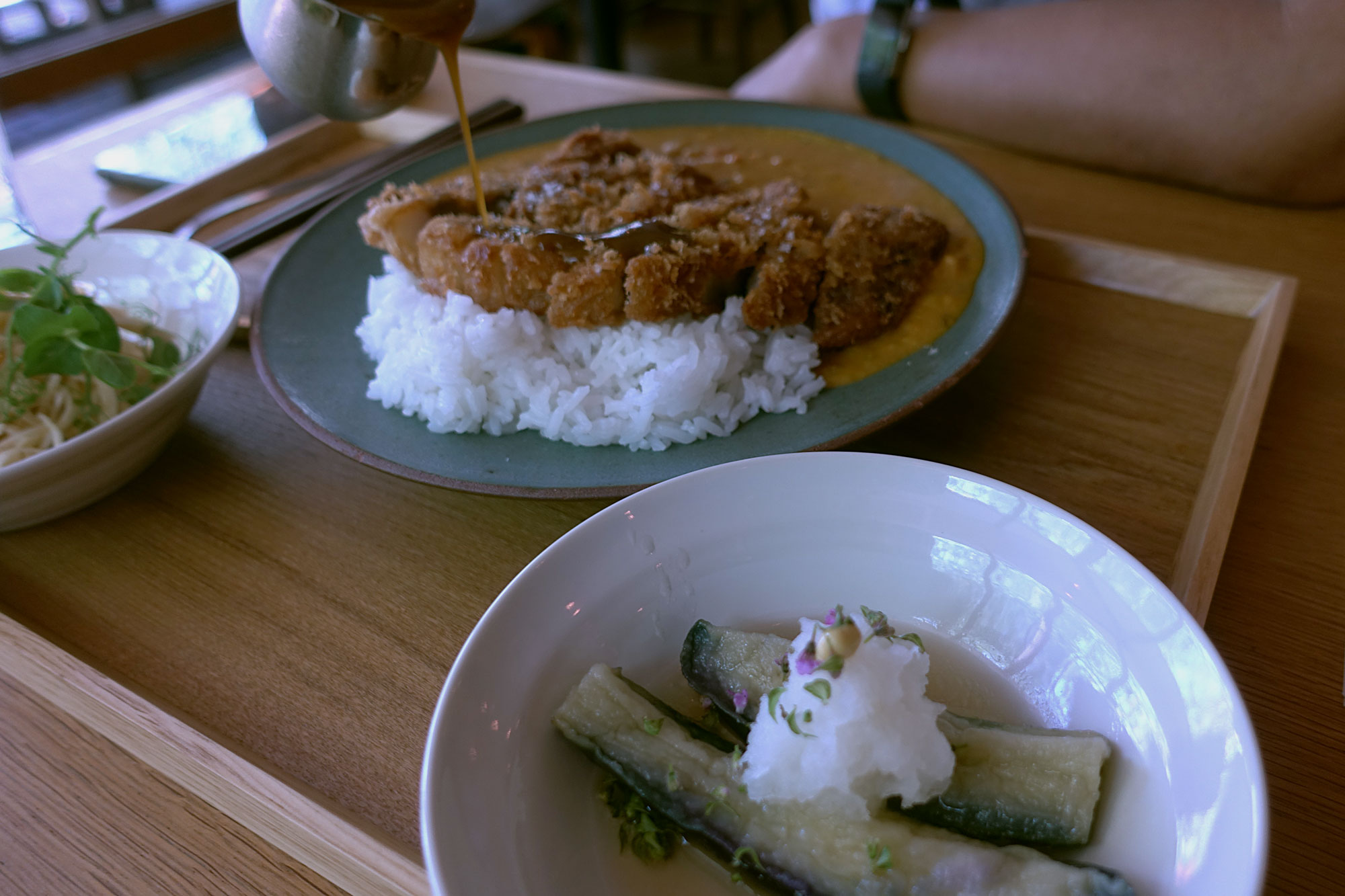
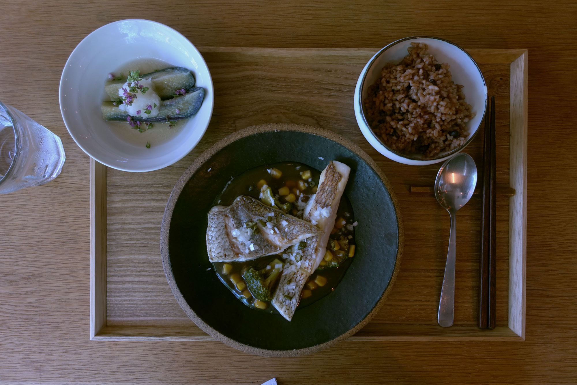
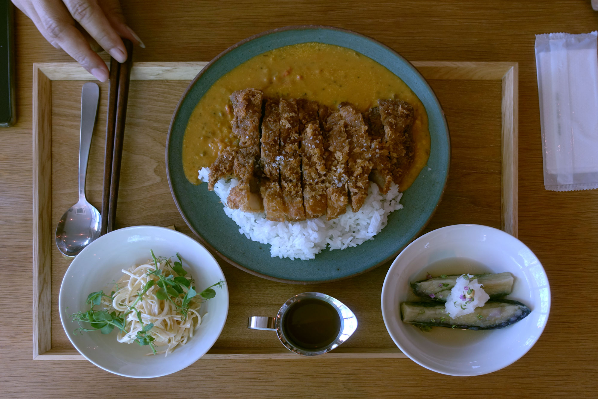
When I found biotop online, they said that the 3rd floor is a café called “irving place” and they did not say it had impressive food. When we arrived it was instead a restaurant called “Like” and it had really impressive food.
It was only after leaving the place that I found out that the restaurant is recently opened by Chef Harata, who has been featured in Michelin’s Bib gourmand for 6 years running. It is his third restaurant. It is not on any travel guides since it opened this year but its probably gonna be on some soon!
Ok back to the story, we looked at the menu outside set in plain text. Pretty simple items like “katsu curry” or “sea bream” that we often see in Japan and the price was pretty normal as well. They were like maybe 1500 yen which is really middle class by Tokyo standards. So went in being the only customers(we are a tad early maybe 11+am). It was like an open kitchen concept we can see a bunch of young chefs in T-shirts but working very seriously in silence.
When the food arrived, we were surprised that it was not what we expected. It was like every part of the meal offset our expectations by 1 point. The eggplant has purple tiny flowers topped on it, the rice was fermented brown rice, the curry was spiced differently from usual japanese curry and had a sour undertone, the katsu had a slightly different crisp to it as well. It was not normal tasty, it was avant-garde tasty.
(ABOVE) Notice their lighting in broad daylight. (上)素晴らしい照明デザイン
(ABOVE) Many of the chairs were different and I noticed a good one (上)いい椅子だね
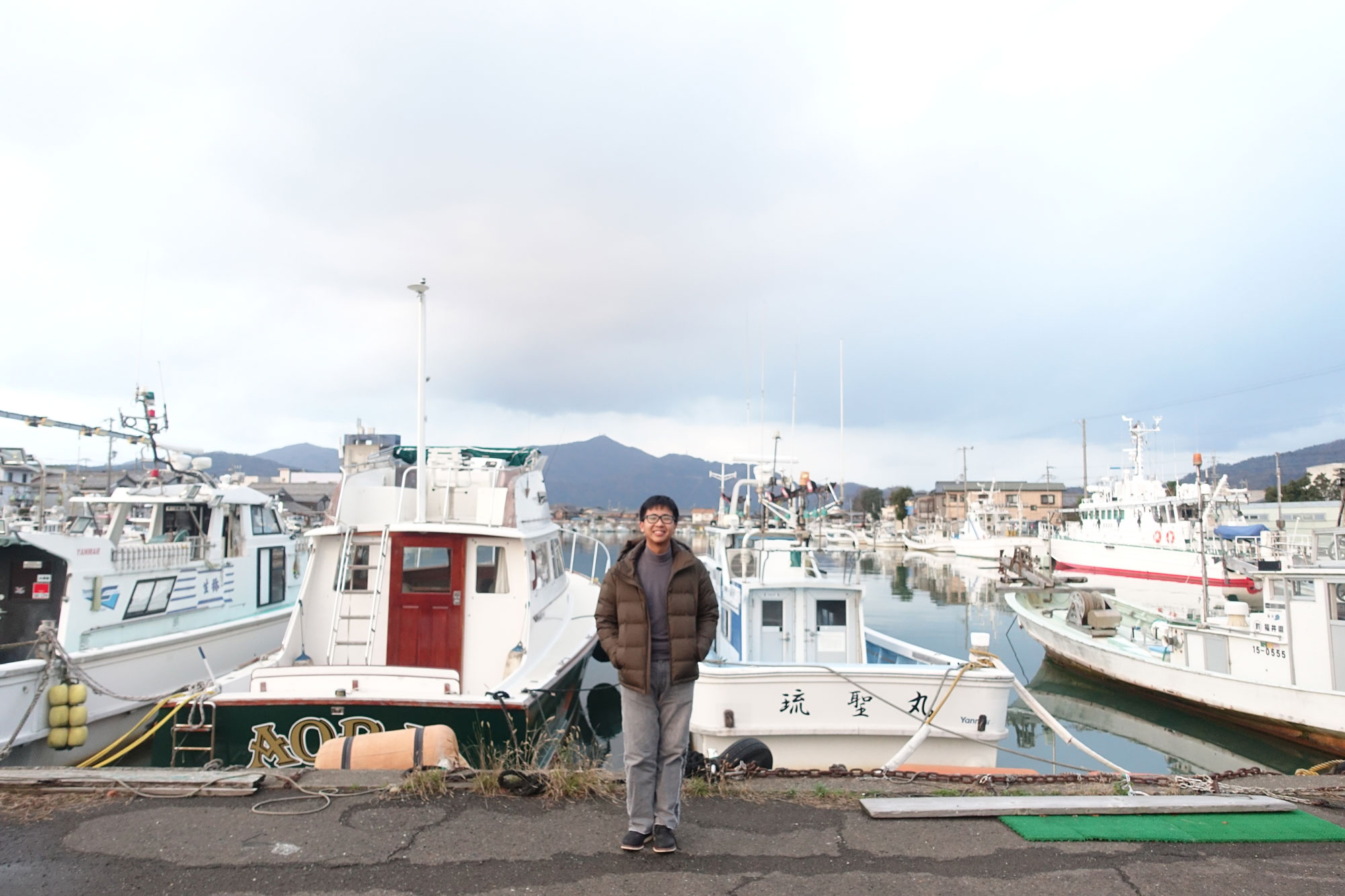
Thanks to participating in the 50th anniversary of the Singapore Japanese Speech Contest, I got a free homestay to Japan. This time we visited an area which just opened up for homestay for the very first time, it is a fishing town called Obama in the Fukui Prefecture. It got some publicity for sharing a name with the former US president but it is much more than that.
They are closeby to Kyoto, the former capital, which is why they were once the emperor’s food supplier. It was also the port where travellers from Korea or China enter to visit japanese nobles. The people here are historically brilliant in their food and entertainment culture. They are experts in fishing, understanding the various species of fishes and their seasons. The local fish market1 has a wide variety of fresh seafood-striped, transparent, you name it. They are just caught nearby so you can eat them at the restaurant right beside without paying much transport cost. It has a kaisen don with 11 types of seafood all in one. They are also great at fermenting or preserving fish5. They were the start point of the Mackerel road or Saba Kaido(鯖街道) where they transport fishes further inland, this takes days thus requiring preservation expertise.
More than seafood, they also have farmlands and mountains for a variety of vegetable stock. People usually buy gifts for the nobles from here which is why they are also the biggest lacquered chopstick provider2 in Japan. This is accompanied with centuries old sake brewery3 and a japanese sweets shop4(they have one of the 3 shops in Japan that holds 2 of the highest accolade in the industry) Working side by side with the food culture to host travellers going to the capital, they also have a geishas6 to entertain people. What they have today are interesting music and point-based games that are rare to find elsewhere. My friend and I managed to experience all of these historic goodness in our short time here.
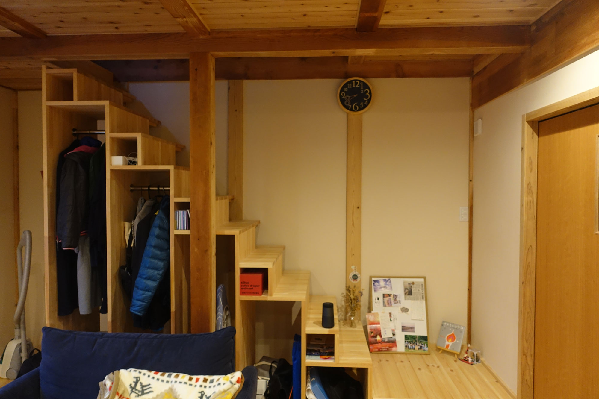
Besides the traditional food culture, we also saw a side of Obama that is forward-looking and evolving. Due to their pristine location, next to the Japan sea, they could carry out marine studies well. Thus, the Fukui Prefectural University1 has a campus here just for that. They continuously carry out research to better the understanding of marine livestock. A recent result of their study is feeding sake remnants to fish to make them tastier! Next I will like to talk about my host family4 , a young good-looking couple. They built their own house and its almost like its from a magazine. Its modern and has great wood, feels real good. They have a mini library(we call it that haha) with many books, boardgames, projector and even a hammock! I think they are redefining what an attractive lifestyle is for young couples in the countryside.
The husband runs a company3 that revitalizes barren land in the town to make them fertile again. This is a great initiative in a time where many leave the countryside for big city dreams. The countryside should not lose in cool places and Obama has a green cafe2 that is just that. They have vintage vibes and hanging plants, they also occasionally organise hipster sustainable Scandinavian-inspired pop-up markets outside the place. They are a couple of retro cafes around that has chimneys and cool drinks and all but green cafe’s owner is kind of obsess with plants. it shows. We were talking about Isamu Noguchi, nomad culture and other things, real interesting guy. Lastly, building something new on the existing rich food culture of Obama is a italian restaurant called La Verita5. The owner showed us cheese making and we got to eat raw cheese! I really love the texture , slightly chewy haha. We eat wagyu spaghetti as well.
Overall, it has been a great trip. Like many towns in the country across Japan, the population of young people are falling and leaving for saturated cities. It warms my heart however seeing the efforts the young people here make not just in preserving their edge in traditions but also in evolving and redefining their lifestyle to make it exciting for young people again. This ignited my thought about branding local communities and social problems in the flailing countryside.
Back to the basics again. My first semester in Japan marks my foray into product design. I think I will do alot more model-making from today. I also got back into something I have not touched on for years. Realistic sketching. Something that I am comparably weak in, however I may want to document it and hopefully improve in the future.
#1 The evolution of shape
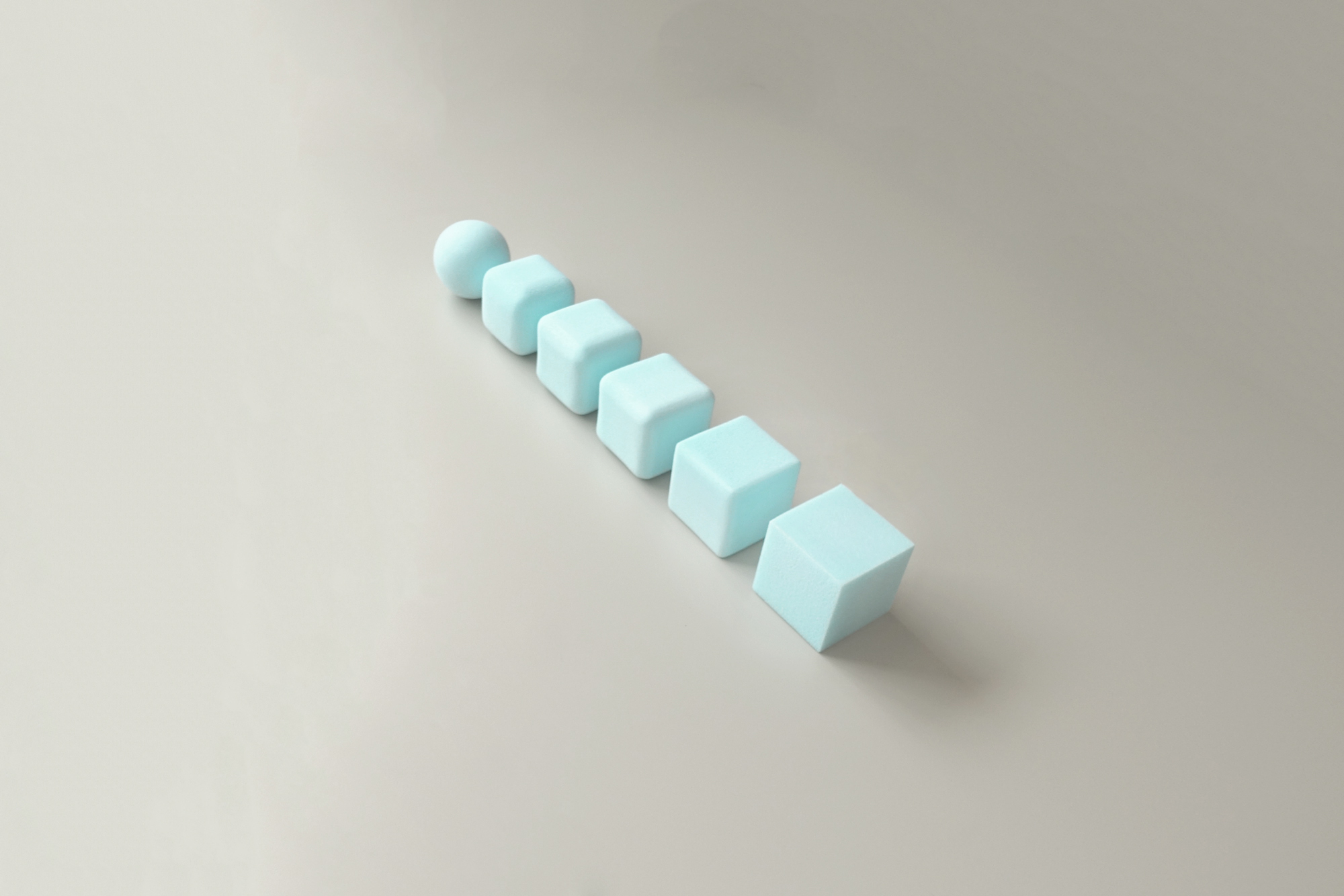
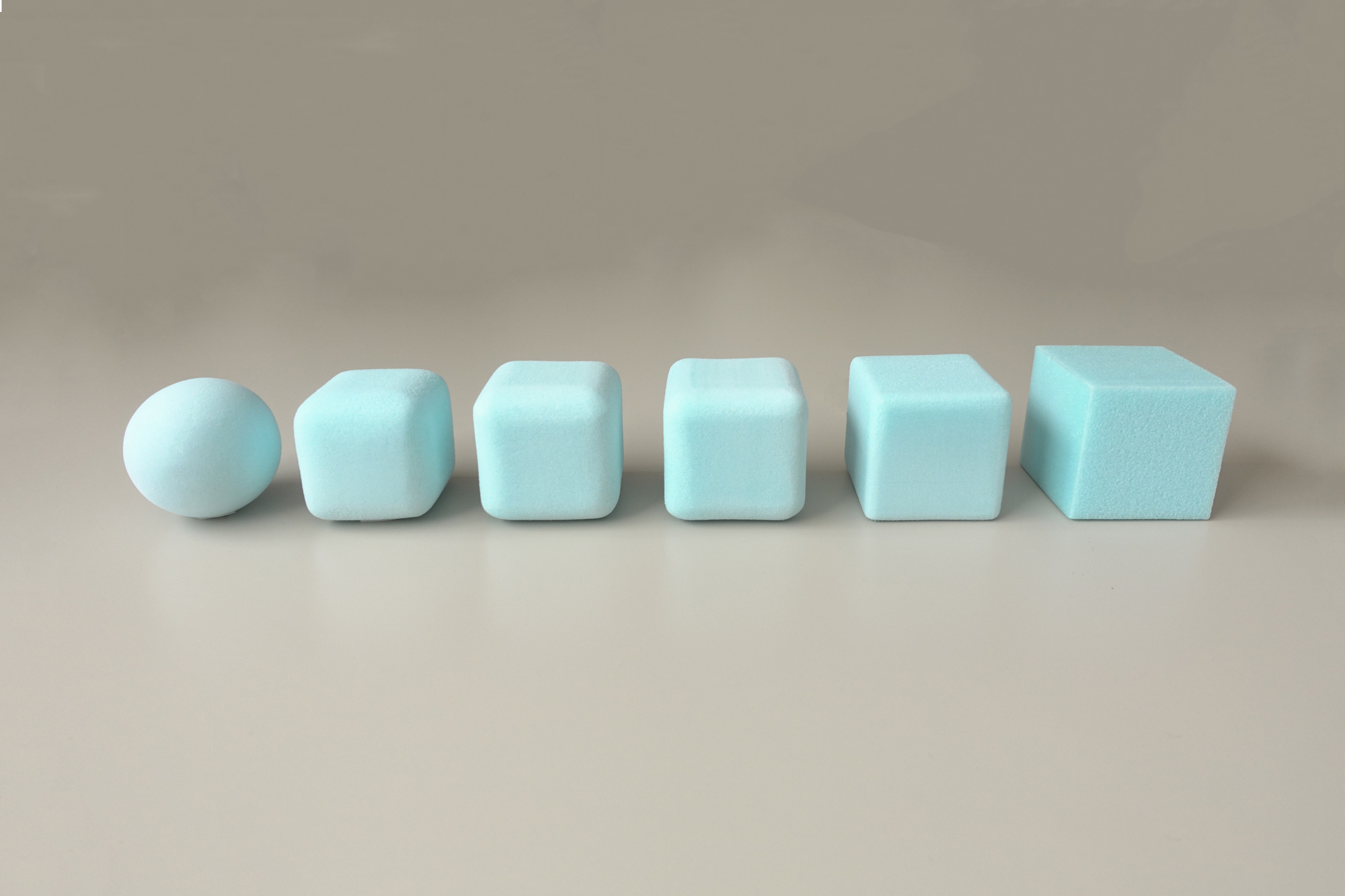
Our first product assignment is for having sensitivity to ‘R’ which is the radius of objects. Each block varies 5mm in radius till it becomes a sphere. A similar block-shaped clock would have different functions based on its R, if its more rounded it would be a travel clock and if it had no R, it would be likely for being placed on the table. We are supposed to make these shapes out of giant urethane blocks. It doesn’t look that way but it is incredibly tedious to sandpaper it to the current shapes with accuracy.
#2 Planes
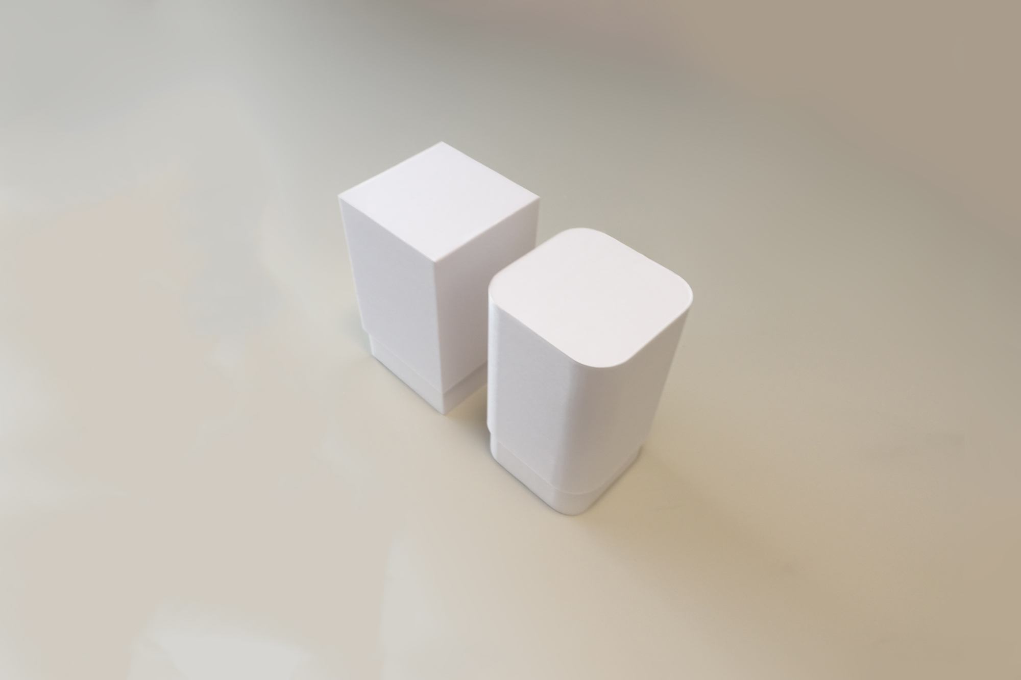
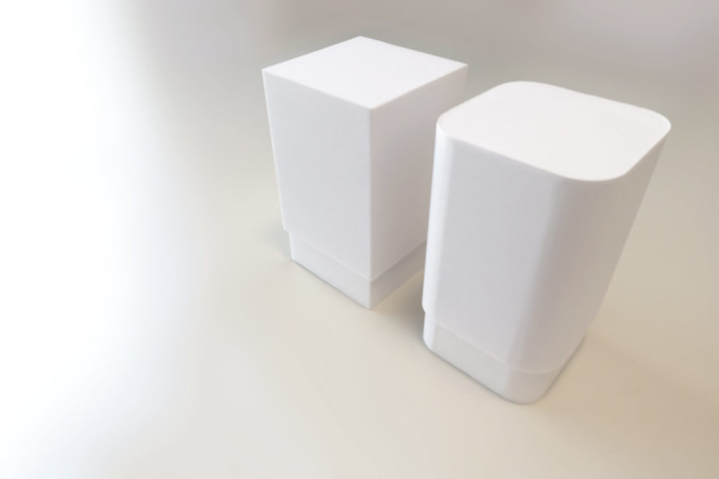
Another model-making assignment was making boxes using styrene boards and we were taught a bunch of cutting techniques for it. One box is supposed to be roundish and one squarish, the design is up to the designer. Working with styrene boards is tricky as well, borders might stick out, there are be crinkles, pencil or glue marks or things might just not align. However, I managed to get the radius to match despite the thickness and the boxes are chosen for exhibiting in my school’s open campus. hehe.
The square box I made opens up to two tiers.
Despite having similar measurements in the exterior, it opens up to a simple box as compared to the squarish box.
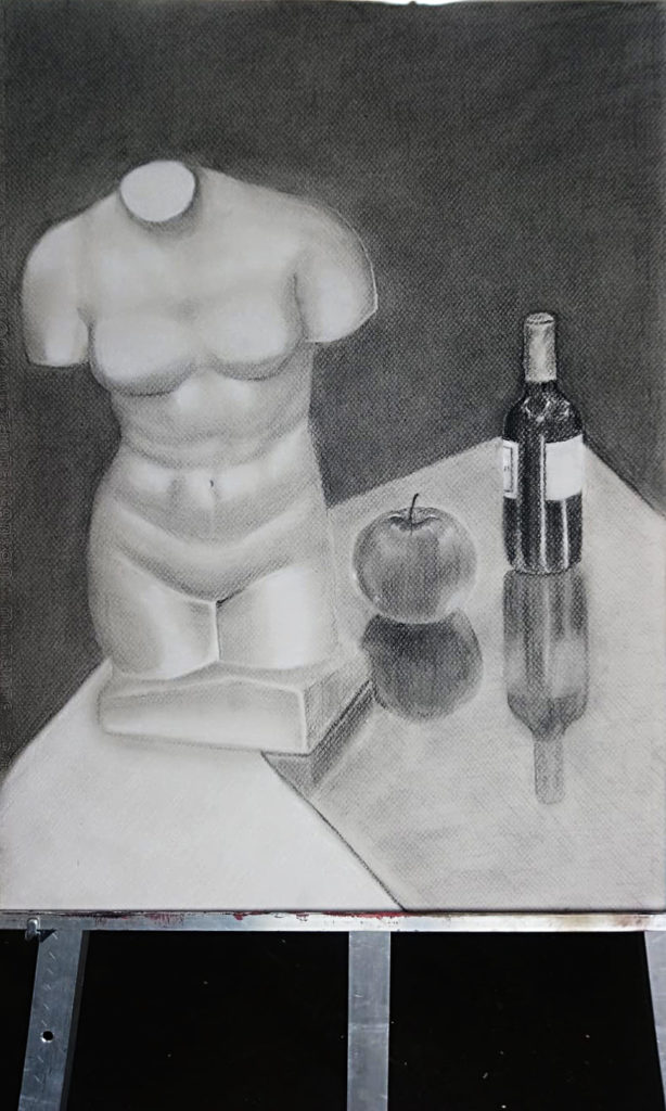
#3 Still life
Arrrhh. I recall getting a ‘C’ for basic drawing classes during Poly. Actually this is an improvement since then but still a far cry from the local students. Probably last place in terms of skill. I have much less texture, less interesting composition and my table’s perspective is all wrong. This is done on grey paper using black and white charcoal. The takeaway for me is that I now understand light better.
#4 Campus Scenery
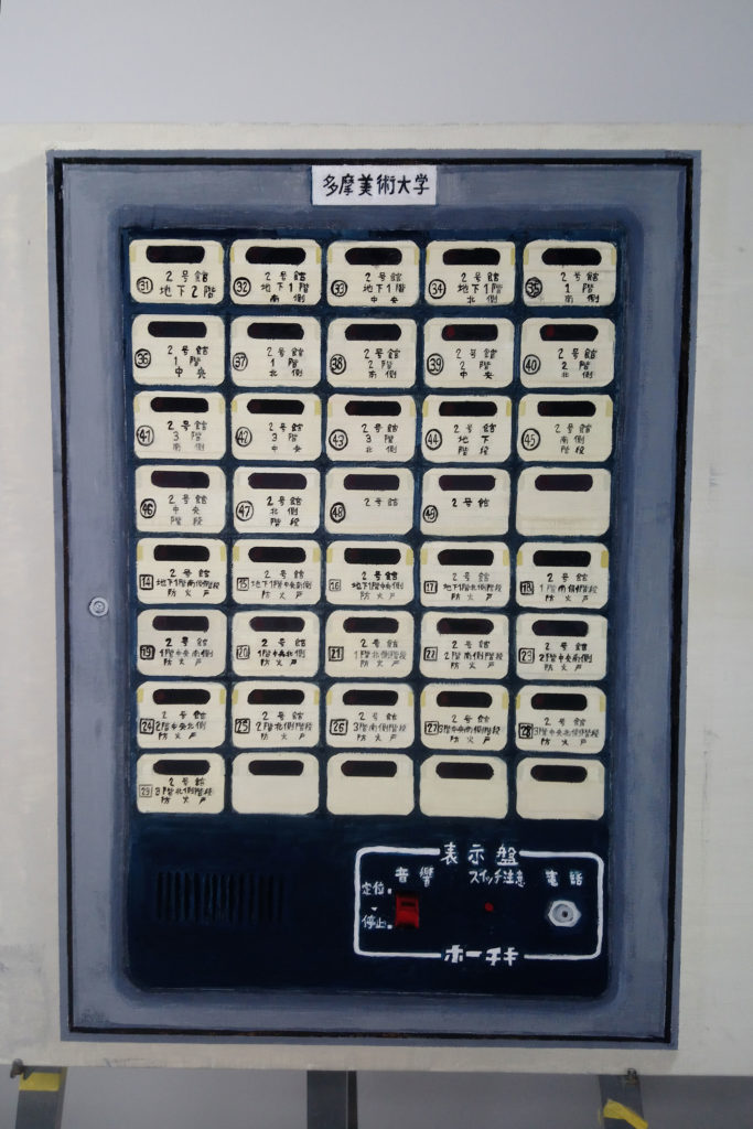
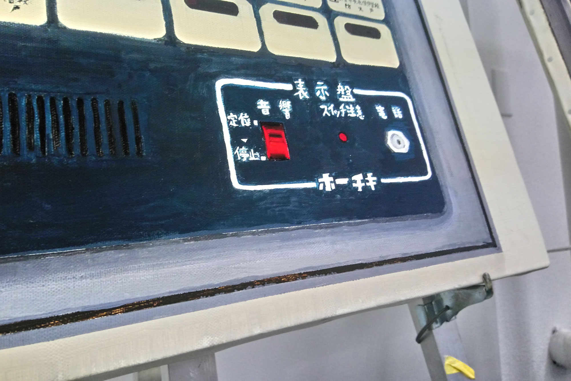
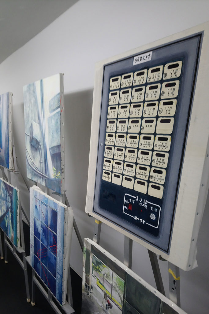
This is literally my first ever acrylic painting. We had to paint a scenery in the school and I chose a strange thing, I chose an electric or control panel sort of item, where I show the buttons and typography in a flat manner. Miraculously, it was chosen for exhibition, I think mainly on the basis of having an interesting choice of composition. This time I narrowly made it but I will attempt more such renderings that uses traditional mediums rather than the computer. Hopefully next time I can execute it in a cleaner manner.
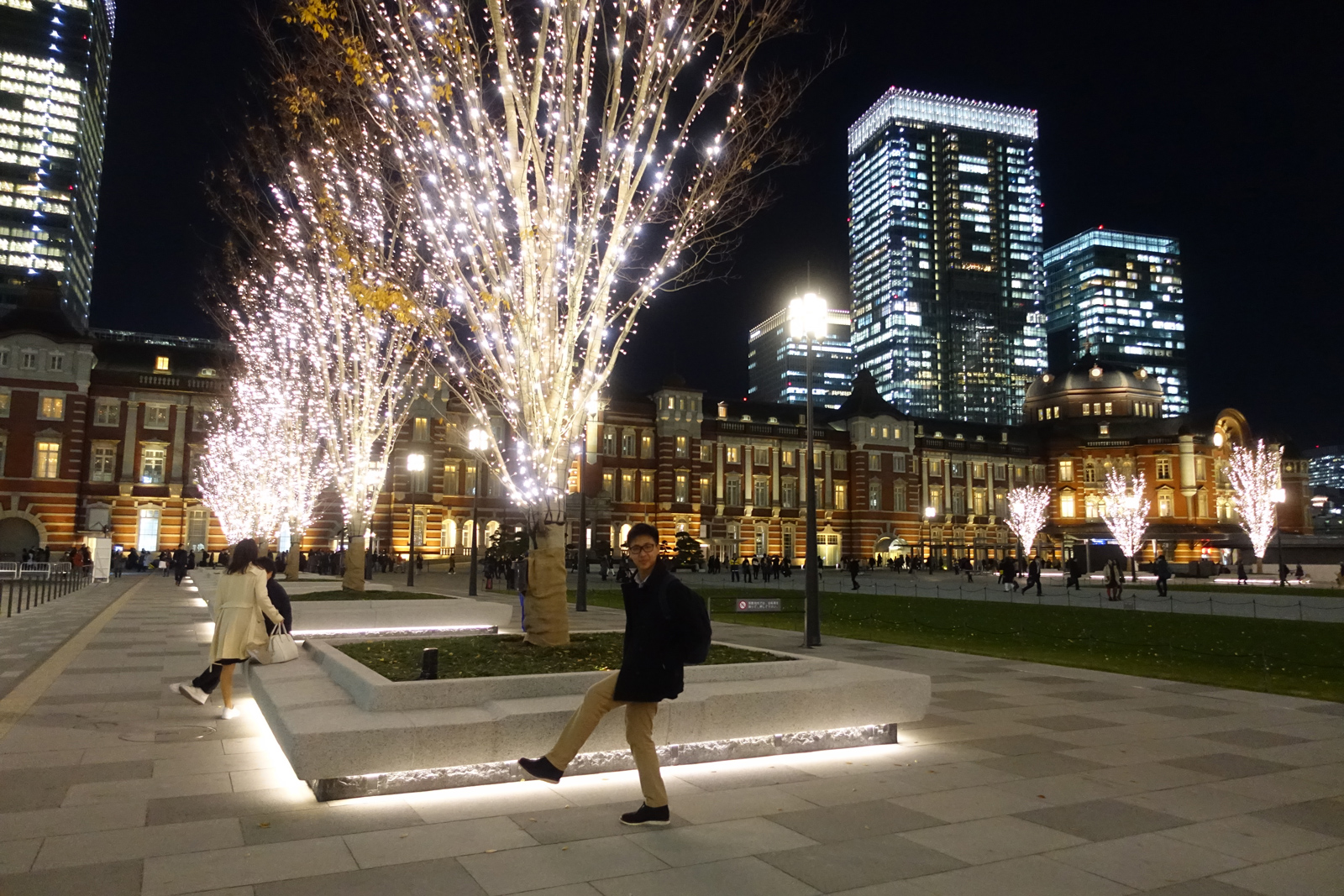
Once again, another long overdue post. I visited Japan in December 2017 when I had my university entrance exam. It was the christmas period and Tokyo was full of beautiful illumination. I won’t talk about the illumination much below but some great places for that were Tokyo Midtown and the area around Tokyo Station. Really classy places. You won’t get that level of illumination in Singapore, Japan really prides itself in its lighting design.
At that time I was really into Lisa Ono and Bossa Nova, hence the music choice, but now when I look back it might be cheesy but oh well. I shot and edited all these back in December 2017 but I missed the time to upload during christmas then. But now I finally decided to make a post on it. I am living in Japan now so I will probably have even cooler places to show in the future. This list of 6 places include some places you will not find in other english media that I really like such as “CHOCOLATIER PALET’DOR”. As mentioned before, it would not just be places of design interests, but anywhere I enjoy. I merely named it “DESIGN TRAVEL GUIDE” because it is a list made by a designer, me in this case.
DISCLAIMER☞All these photos are shot and edited in 2017 so the state of the shops reflect that time.
#1
CHOCOLATIER PALET D’OR ショコラティエ パレ ド オール
★★★★★
Address 〒100-6501 Tokyo, Chiyoda City, Marunouchi,
1 Chome−5−1 新丸の内ビルディング Access 5 minutes walk from Tokyo Station
Hours
Mon-Sun: 11:00~21:00 Photos courtesy of CHOCOLATIER PALET D’OR’s instagram and relevant parties.
I’m used to seeing big global chocolate brands like Godiva or even Japanese ones like Royce. However, ever since I watched a Japanese drama on chocolatiers, I have developed an appreciation and curiosity for chocolatiers. I found a Japanese chocolatier –not in a food guide book– but in a brand identity compilation book. It was chosen as an example of brilliant brand design and I could not agree more. Typographically state-of-the-art. From the chocolates to the store and packaging, this is the kind of experience I was hoping to find in Japan.
I went to the store near Tokyo Station, in the Marunouchi building, overall a beautiful area. The store had seats with certain dine-in menu, the ice-cream looks great but what was really interesting (in 2017) was their transparent cocoa drink. It was fascinating. Their stuff is actually pretty expensive, but I think they make very decent souvenirs for slightly more important people. Especially since it is not a global brand and can only be obtained there.
#2
Creamia
★★★☆☆ Website http://www.nissei-com.co.jp/cremia/en/ Access Various locations
Hugely recommended at that time, but these days I find it everywhere. True to what everyone says, its a really great soft serve. I even watched a video that explained that the people behind it used science and years of research to develop the perfect taste, texture and even the perfect cone that complements it.
#3
La Mère Poulard ラ・メール・プラール
★★★★☆ Address 3 Chome-5-1 Marunouchi, Chiyoda City,
Tokyo 100-0005 Website http://www.la-mere-poulard.jp/ Access 2 minute walk from Tokyo Station
Hours
Mon-Sun: 11:30~22:00
I saw a facebook video about fluffy omelettes and after further probing, found it to be La Mère Poulard. It originated as a french inn in 1888, with their giant omelettes cooked in a wooden hearth being hugely popular. It was also on an island which was the reference for their original logo. As of now, it seems that this restaurant can only be found in Japan besides its home country of France, which makes it worth a visit if you are in Japan. The brand identity design is pretty impressive here as well, they keep the consistent red and the interiors make you feel like you are transported to that french island where this place was first opened on. I had the omelette which is really interesting texture-wise but it was not too spectacular for me personally, but I did notice the Japanese customers finish it well, perhaps it is more fitting for the Japanese tastebuds.
#4
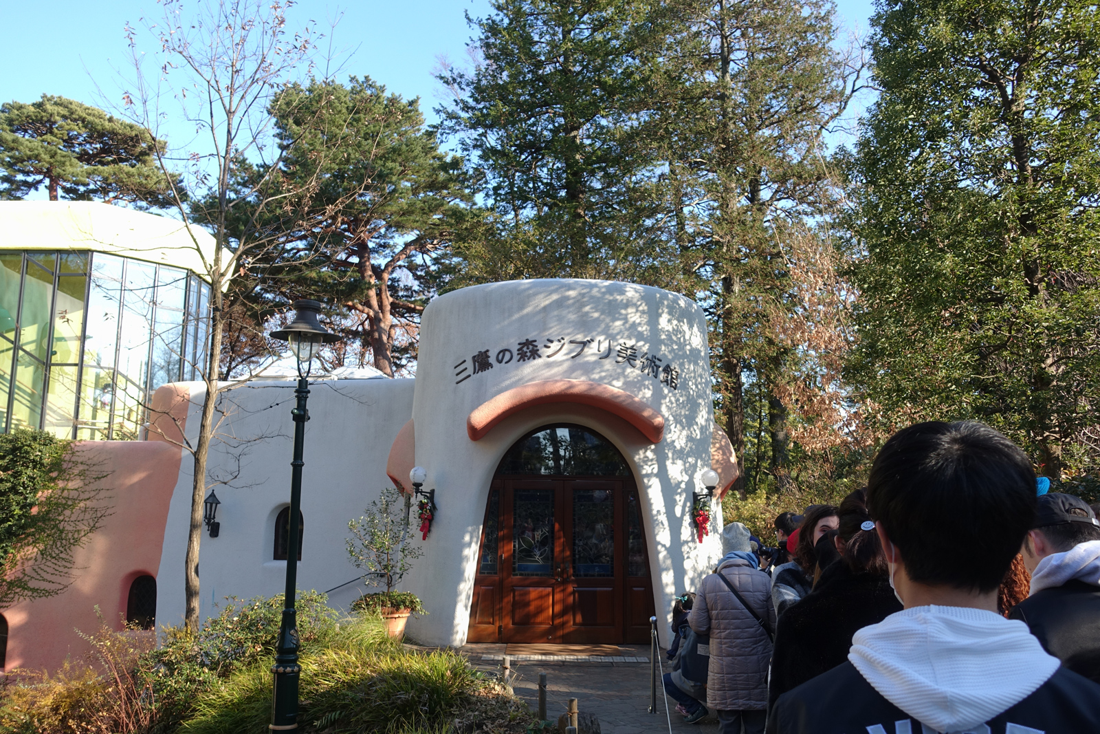
Ghibli Museum 三鷹の森ジブリ美術館
★★★★★ Address 1-1-83 Shimorenjaku, Mitaka
Tokyo 181-0013 Website http://www.ghibli-museum.jp/ Access Take the cat bus from the JR Mitaka Station
Hours
Mon-Sun: 10:00~18:00;
closed on tuesdays;
“Let’s get lost together” is the museum’s slogan. Photography inside is forbidden so I cannot show much but this is a magical place. There are delicately crafted exhibits in every corner, many layered or have moving mechanisms. This means even the manhole are designed and there are places you have to crouch to go through. It really feels like you are in a Ghibli movie.
The exhibition on that time was about food in their movies and they remade several kitchens into sets that we can explore. It also documents the tedious behind-the-scenes process in creating an animated film. In line with the theme of food, they had a short film called “Mr Dough and the Egg Princess” screened in a delightful mini theatre. From the art deco lamps outside the theatre to the illustrations on the ceiling of the theatre, its a dream come through–I mean having your own themed theatre showing tailor made films and perhaps even have deliberately crafted trailers before the film is super cool. The short film is also a silent film such that tourists from any country can understand it without having a hundred different subtitles. My entire family loved it. The short film they make are specifically made for the museum and they renew them once in a while, along with new exhibitions, giving the museum a lot of revisit value.
This is a must-go, however tickets are hard to come by. Tickets for the month go on sale on like the 10th of the month but they sell out real fast. It was the case for me and I had to ask a friend residing japan to help me get it. Apparently they have separate quotas for buying in Japan and from overseas. You should google it.
#5
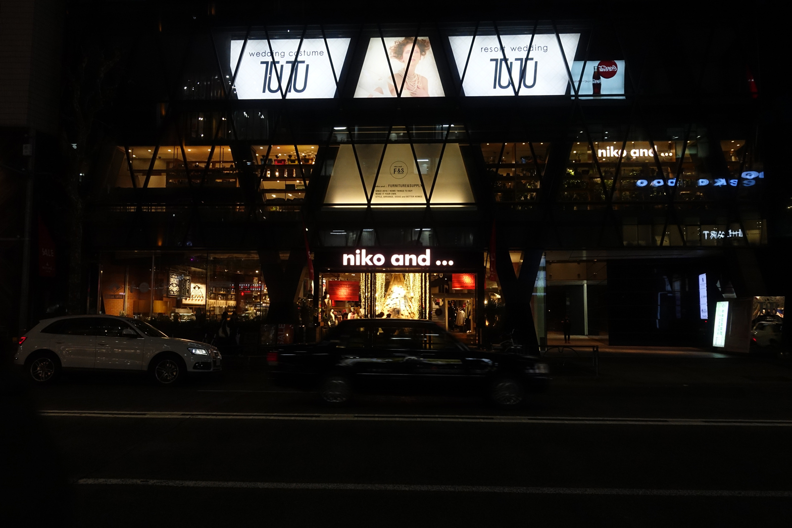
niko and … ニコアンド
★★★★☆ Address 6 Chome-12-20 Jingumae, Shibuya City,
Tokyo 150-0001 Website http://www.nikoand.jp/ Access 4 minute walk from Meiji-Jingumae Station
Hours
Mon-Sun: 10:00~23:00
This is actually a retail franchise but I really like it. I appreciate brands that has a strong concept and art direction that they use throughout consistently in different areas. They can be as diverse as having food, furniture or even clothes in the same brand. A good example is IKEA and MUJI whom also have a strong typographical system throughout their brand, be it in furniture design, price tags, food menu or catalogues.
Ok so in a nutshell, “niko and …” is most well-known for its clothes but they also sell potted plants, furniture, daily necessities and some stores have a coppe café in it. The idea is that you can attach any other brand name behind [niko and …], so they manufacture original items, carry certain brands and also collaborates with certain brands (from Casio to).
However all of these things are designed or selected in line with “niko and …”s strong and unique visual language. I remember when I first visited, I really love how everything is done originally in its brand universe. They had such wide variety of original goods that you don’t know what you might find, they even have their own gachapon machines that sell tiny potted plant figurines. I remember when I purchased my first item then, I got a beautiful receipt that has an exclusive QR code to a beautiful brand film they made that season. I still store that advertisement in my phone, because they really make some of the best advertisements.
(ABOVE) Not my favourite advertisement of theirs, but still a good one.
The soul of the brand can actually be found in their special “niko and … ” dictionary which is a special edition publication designed by award-winning graphic designer Naomi Hirabayashi who also did the brand’s identity design. This dictionary explains every tiny preference and inclinations that guides the brand. An example is that dictionary states their liking in old luggages full of stickers and scratches or their emphasis on the combination of metal and wood. All of these principals and values culminate to guide the diverse brand to have a hard-to-define yet consistent colour or tone.
BTW, you can check out their painter denim, it sells quite well and I have it. Perhaps next time I will write a post just talking about their advertisements. LOL.